So far my plans for smarter working this year are going well, and I’ve found a little time here and there for some creative play. I’m not entirely comfortable calling it ‘studio time’ because I don’t have a studio and also I’m not ‘an artist’ in the establishment sense of the word. Middle-aged woman tearing up paper in the spare bedroom doesn’t really sound all that engaging though.
I guess we are all artists, in our own way.
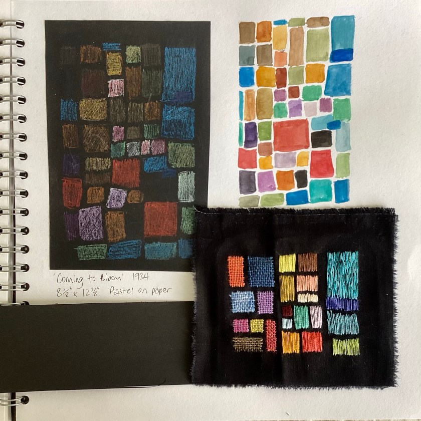
I’ve been working on (playing with) collaging the pages of an old 6″ x 8″ notebook, using my own painted papers. You learn how to do this in my Painted Collage Paper and Mark-Making course, by the way. A little self-promotion there from my Marketing Manager (that’s me).

I’m intending a celebration of winter in this sketchbook. If you’ve been with me a while, you’ll know it’s my favourite season, and January is my favourite month. It’s cold, it’s still dark, it’s grey, it’s quiet, and nothing much happens, and all of that suits me perfectly. And we’re half way through it already. It’s ok, I like spring too.

For now all I’ve done is cover the pages with printed/painted papers. I’ll go back in to each page with either more paint, mark-making, more collage, or some text.

I’m really enjoying the muted colour palette.


There is, however, a slightly perplexing problem. I appear to have developed contact dermatitis, but only this week, and only on my right hand. Since I’ve been handling paper with both hands, my prime suspect is the acrylic medium I’ve used to stick the papers down. It seems odd to suddenly develop an allergy to something you’ve been using for years, but I can’t think what else it could be. I’ll try some (biodegradable) gloves and see if that solves the problem.

Wearing gloves is probably sensible in any case when working with paints and inks.

It’s been a good few months since I made time for activities like this, and I realise how important and restorative it is. I’m being very strict about my working hours (no social media at weekends, no working beyond 5pm, and a weekly half-day for creative exploring).
So far so good. Wish me luck with the gloves!