I’m often asked whether I can guarantee that my hand-dyed threads are colourfast.

The short answer is: no, I can’t. Domestic dyeing is different from commercial dyeing and the results can never be guaranteed.
The longer answer is: with due caution they probably are, if you’re careful – by which I mean (obviously, I hope) no boil washing and no bleach. A gentle warm hand wash will *probably* be fine, but no promises.
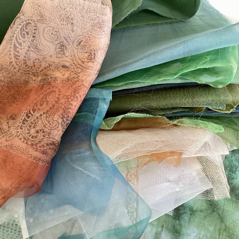
I dye my threads with Procion fibre-reactive dye, and after dyeing I wash them in the machine, on a mixed load setting, at 30 degrees with regular laundry detergent. I don’t use Synthrapol, and I don’t use a hot wash. Silk threads are delicate, and agitating them at temperatures over 30 degrees could be damaging. I set the machine to do an extra rinse after the standard mixed load wash.
Incidentally, people sometimes express disappointment that the threads aren’t dyed ‘naturally’. The reason I use Procion over natural dyeing is that Procion is quick, easy, reliable, and doesn’t require additional energy resources, as in simmering or steaming, to set the colour. I don’t own a microwave, and at today’s gas and electric prices, I’m not willing to simmer/steam several pans of thread for an hour each time – as well as the environmental impact of using additional energy for heating. All dyeing takes energy and resources, as does all textile production, but if I can keep the energy use to a minimum I’d prefer that. Many people do great things with natural dyes; I’m afraid I’m not one of them.

Anyway: back to the Procion, and I did a little experiment of my own.

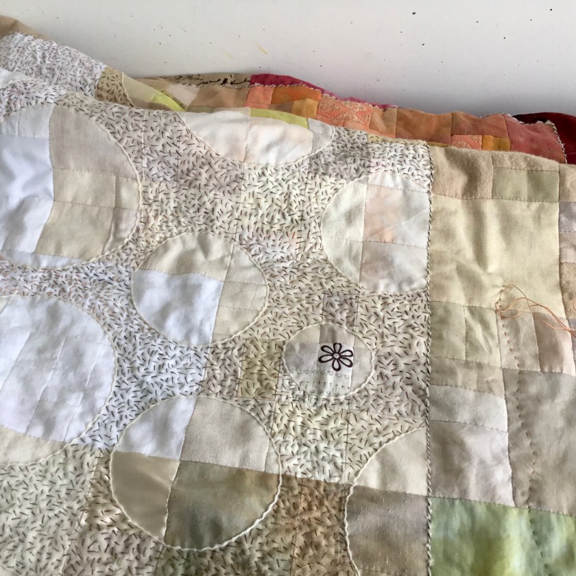
I made two (awfully rough) stitched samples with various silk and cotton threads, all hand-dyed with Procion, on white brushed cotton. I soaked the lower sample (in the above photo) in hand-hot water with regular laundry detergent for half an hour, and then rinsed it in hot water. I can’t see any noticeable colour escape. I don’t know whether water quality affects colourfastness – the water in our area is very hard indeed. Soft water might make a difference.

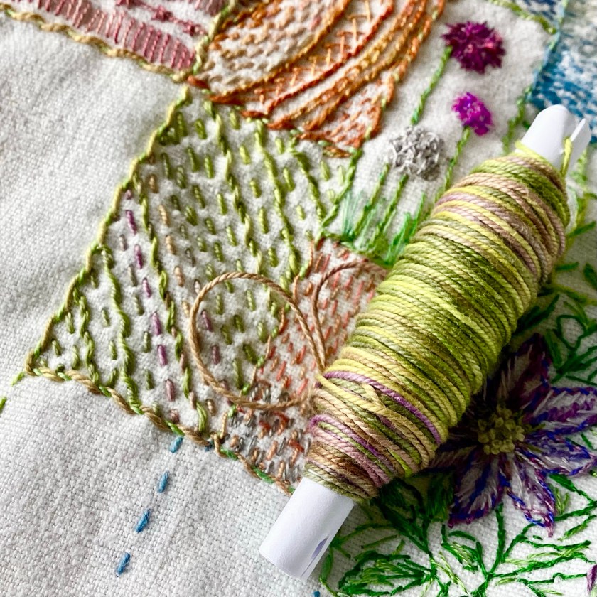
And exactly the same process above, with this DMC cotton floss. I’ve listed a few of these in the shop, just to see how they go – as usual, unique and unrepeatable colours, but I’ll hope to make some more soon. Ish.
I did expect some trouble with the magenta sections of this space-dyed thread (above), but no – not as far as I can tell. Red and magenta are notorious for leaching colour, and which of us has never accidentally dyed a load of washing pink because of an errant red sock?
So there we are. I still don’t guarantee colourfastness, and if you really need to wash something that is stitched with my hand-dyed thread, then I would advise testing it first. Mostly my threads are intended for purely decorative work, which will rarely, if ever, need washing.

And if you have washed anything that I’ve supplied, I’d be interested to know how that went.