And that was July. I blinked and almost missed it. Just as well I had the stitch journal to keep me focused and present for at least some of it.
Stitch journal, July 2022
As always, it’s still made of mostly very simple stitches – running stitch, couching, blanket stitch, chain stitch, herringbone and fly. I’ve used a wide variety of threads, from very chunky perle no. 3 or 5 to very fine silk sewing thread. Some days are light as a feather, and some days really weigh you down.
Stitch journal, July (details)
Lots of summer colours in this month. Parts of July have been almost unbearable, it was so hot. The heat was suffocating.
Stitch journal, July (detail)
Summer is my least favourite season but I have tried to find something to love about each day. I think that’s what keeps most people going. And that’s all the stitch journal is ever going to be, of course. Just a record of days passing, with needle and thread as witness.
Stitch journal, July (detail)
Yesterday was World Embroidery Day (how do these things come about? Who decides?)
I turned yesterday’s block into a little embroidery sampler. It was that kind of day.
A sampler block on the stitch journal for World Embroidery Day
Tomorrow is 1st August, in the pagan calendar Lammas, which marks first harvest and the start of autumn. It may still feel like summer, but seasons and weather are not the same thing. Already I can see the light starting to change as nature prepares to move us from one season to the next. And there is space on the stitch journal to take another step forward into a new month.
There has not been much textiles work here apart from the stitch journal, which is keeping me sane and centred.
Stitch journal with templates in progress
I am spinning a few plates at the moment, two of which are intangible. I’m continuing to find my way round Procreate, the digital drawing app, and am really getting to like it.
Design for my RedBubble shop, inspired by a 1938 Paul Klee painting ‘Dancing from Fright’
This design takes figures from Paul Klee’s painting ’Dancing from Fright’, which I think is an intriguing title in itself. And slightly funny, though of course there’s nothing funny about being frightened. I like to think these little dancing figures are happy rather than afraid.
I’m also impressed by RedBubble itself – they have photos of what your design will look like on various products. I like this one:
Notebook in my RedBubble shop
I’ve now had my first sales, which is encouraging. Slowly but steadily I’m trying to get myself to the point where I can spend more time focusing on my creative work. Ideally I want to get to a point where I no longer need the day job.
The other intangible product of the week is a PDF file, which can be purchased from my online shop. It contains the monthly templates for my stitch journal, plus some notes about how you can use some very simple stitches to create interesting effects. Special introductory price until 31st July, after which the price will be increased.
PDF available from my online shop, page link in the menu bar
I’ve really enjoyed creating the PDF, and I hope it will encourage others to start something similar. Daily stitching by hand can be mindful and restorative, and allows for time to be still and quiet. And I think we all need a bit of that.
Apart from splashing a bit of paint around last week while on annual leave, I’ve also made a start on setting up a shop on RedBubble. It’s a print-on-demand site where you upload your work, then people can purchase it in various forms (stickers, T shirts, phone cases, etc), and you get 10-20% of the sale price.
New shop on Red Bubble
It’s still very much a work in progress, and I will be adding to it/tweaking it over the next few weeks and months. Just dipping a toe in the water to see how it goes. It may work and it may not, but you never know unless you try these things.
I’m also teaching myself to use Procreate, a digital drawing app. It is fun and frustrating, as well as surprisingly absorbing. I have probably had too much screen time and not enough stitching time recently, but it will balance itself out eventually. New things always take longer than you expect.
My shop banner is very simple but I quite like it.
Simple banner made in Procreate using a photo of a silk embroidered moon
Most of all this past week I have enjoyed the freedom of not having to go out to work, and the luxury of time to do some of the things I’ve been wanting to do for a while. Time is one of the most precious things we have and last week it was all mine.
I’ve been taking some time out this week, just to look and think, and it’s been immensely restorative.
I like playing with watercolours, though with no real expertise. I normally use a student-grade Cotman set, which I’ve had for about twenty years, and they are generally fine just for rough sketchbook work. I also have a small portable set of Sennelier professional half pans, which are better quality than the Cotman. I think tubes are better than pans for larger or more experimental work, so I thought it was perhaps time to invest in some professional quality tubes. I bought a set of Daniel Smith dot cards, which are basically a small but useable dot of paint in every shade that they make. You just add water so you can see and feel how each colour behaves. You can see the dots of paint in the photo, and a little goes a really long way, so there is plenty left. I have spent two entire days looking at them, and they are beyond beautiful.
Daniel Smith dot cards and colour swatches
Colour is really magical. It lifts the spirits, it calms and soothes, and it energises. The science of it is baffling. We are capable of seeing only a tiny fraction of the whole spectrum, in which objects absorb some wavelengths of visible light and reflect others. What we see is the reflected light that hasn’t been absorbed by an object. You could say we see the colour it isn’t.
Delicious greens, splashed and splattered
I had assumed that Daniel Smith paints were going to be much the same as any other watercolours but my (admittedly limited) experience is that they are far superior to any other professional colours I’ve tried. I think watercolour is quite a forgiving medium anyway, in that it’s difficult to make watercolours look ugly. These paints are a dream to use, even for a novice like me. They dilute immediately, they are beautifully smooth, and they are really easy to handle. The range and quality of colour is amazing. I made some swatch cards, and then I made lots of samples on 300gsm watercolour paper cut into 2” x 3” pieces.
Little samples, Daniel Smith watercoloursSamples, 2” x 3”, Daniel Smith watercolours. The sample bottom right is watercolour over white oil pastel. I have got some masking fluid somewhere but I was in the zone and didn’t want to disturb myself
I even like the newsprint drop paper that I used to protect the drawing board.
Over the edge: sheet of newsprint
I completely love these paints. Whether they will make me a better artist is absolutely debatable, but the pleasure of using something of this quality will far outweigh any disappointment in the results. The joy is always in the doing rather than the having.
Strips of cotton rag paper with paint applied in rows using a half-inch straight brush
Several of the samples are iridescent. They are interesting but I’m not sure I would use them – though of course, never say never! I’ve cut them out and threaded them onto a bit of cotton yarn just in case. There is also plenty of useable paint on these, so I will hang on to them and wait for an opportunity to present itself. You can get watercolour iridescent medium, so really you could make anything sparkly if you wanted to.
Daniel Smith iridescent colours
I will probably cut the others up into little tags when I’ve exhausted all the paint. Now I just have to narrow it down and choose some colours…
I experienced a proper state of what psychologists call flow this morning – utterly absorbed and focused on making these little samples, I somehow lost two hours. I quite like it when that happens. You literally lose yourself in something while time rolls on without you. You come back to reality slightly dazed, feeling a bit like Rip Van Winkle.
I really like this Klee painting, ‘Oceanic Landscape’ (1929) and have been drawing tree shapes with watercolour. I love the simplicity of these shapes – just a few very easy lines that nevertheless unmistakably say ‘tree’
Oceanic Landscape, Paul Klee, 1929 – sketchbook page
Of course I wanted to see how these would work in fabric and thread. The first sample is layered sheers and silk net on a scrap of very soft brushed cotton.
Little fir trees, stitched area about 3” x 4”
The second is a scrap of vintage linen/cotton sheet, painted with watercolours and then stitched. You can see the imprint of the embroidery frame which kept the fabric taut just while the paint was drying. I will soak and stretch the creases out at some point.
A row of little trees, painted area about 3.5” squareBirdie is looking a little scruffy this season
This sketchbook (so far) is just for me, and just for fun. I’m not sure it’s leading anywhere, although really everything is good practice for something.
Two stitched samples inspired by Klee’s Oceanic Landscape
I’m having a few days away from the day job next week and am looking forward to a break. I have a strong need to paint – who knows where these directives come from? I think it’s probably important to listen, in any case – so will be on paper for a while. Just to see what happens.
Sketchbook cover, Klee’s 1922 painting of a little fir tree. Layered sheers and hand-dyed fabrics with simple hand stitch and applique
The sketchbook cover is finished – despite all the careful measuring and re-measuring along the way, I am always really surprised when it fits.
12” square sketchbook with cover
I have sketchbooks in various sizes, mostly made from papers that I collate and bind myself. This one is a bought spiral bound 12” square one, which is a good size for exploring mark-making and for holding samples of stitched work.
First page: A Klee medley, or Klee’s best bitsSketchbook page exploring blocks of colour
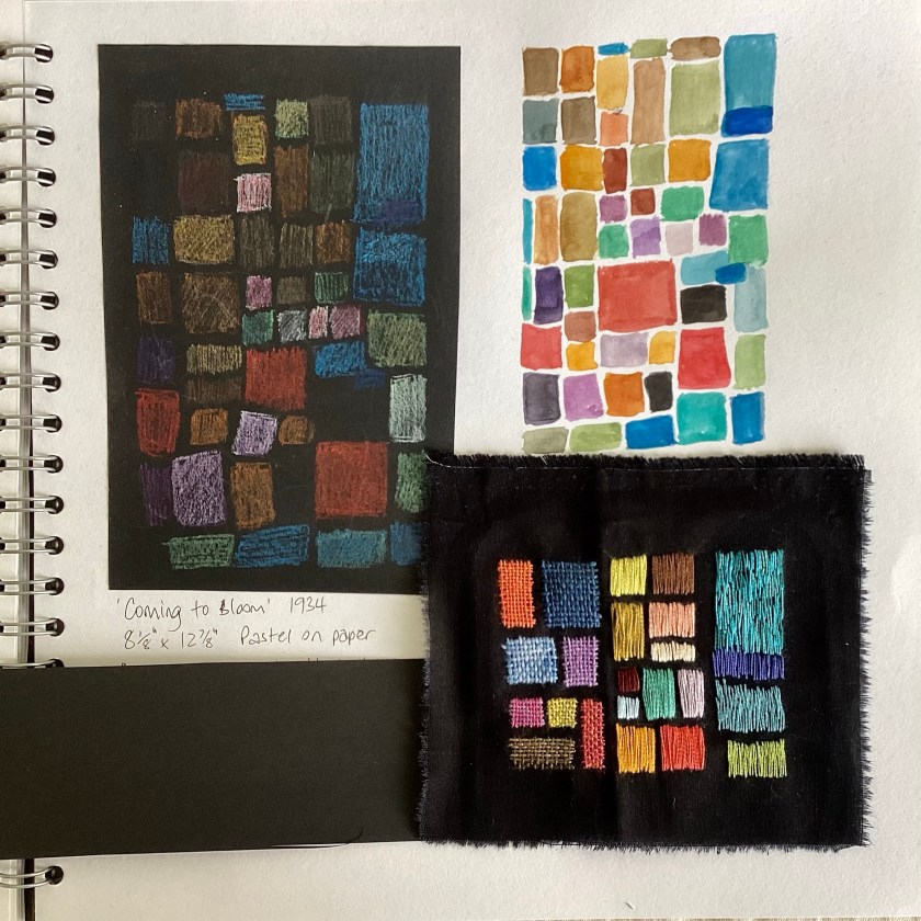
‘Coming to bloom’ is a pastel drawing made by Klee in 1934, on black paper. I made a quick sketch with pastels, also on black paper – the fixative has dulled the colours a little, so I made a duplicate sketch in watercolour on a white background.
Then the fun really started. I made a little stitched sample on a scrap of black cotton fabric, only about 4” square or so, exploring ways of creating stitched blocks.
4” square sample. From the left: needle weaving with hand-dyed threads; rough satin stitch with 2 strands of DMC floss; sketchy long and short stitch with one strand of DMC floss
I really like the woven blocks. The satin stitch blocks have floats that are too long to be practical, but I also quite like the irregular sketchy effect of the straight stitch sample on the right. I worked the samples from right to left, so the weaving was the last thing I did.
Stitched sample on sketchbook page
Not quite sure where all this is going, but then some journeys are about exploration and discovery rather than arrival.