In the zone

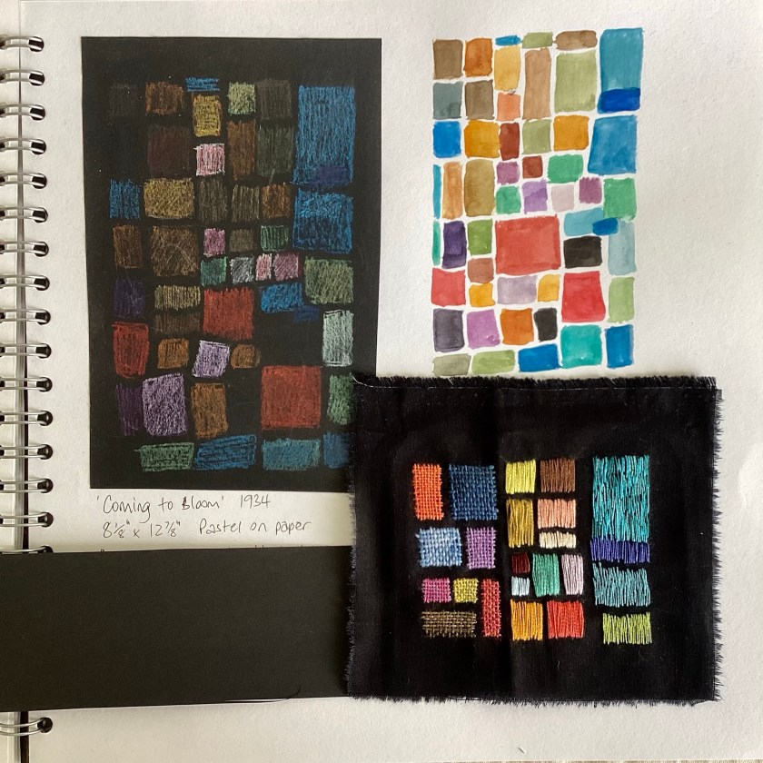
I experienced a proper state of what psychologists call flow this morning – utterly absorbed and focused on making these little samples, I somehow lost two hours. I quite like it when that happens. You literally lose yourself in something while time rolls on without you. You come back to reality slightly dazed, feeling a bit like Rip Van Winkle.

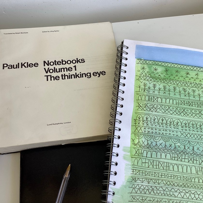
I really like this Klee painting, ‘Oceanic Landscape’ (1929) and have been drawing tree shapes with watercolour. I love the simplicity of these shapes – just a few very easy lines that nevertheless unmistakably say ‘tree’

Oceanic Landscape, Paul Klee, 1929 – sketchbook page

Of course I wanted to see how these would work in fabric and thread. The first sample is layered sheers and silk net on a scrap of very soft brushed cotton.

Little fir trees, stitched area about 3” x 4”

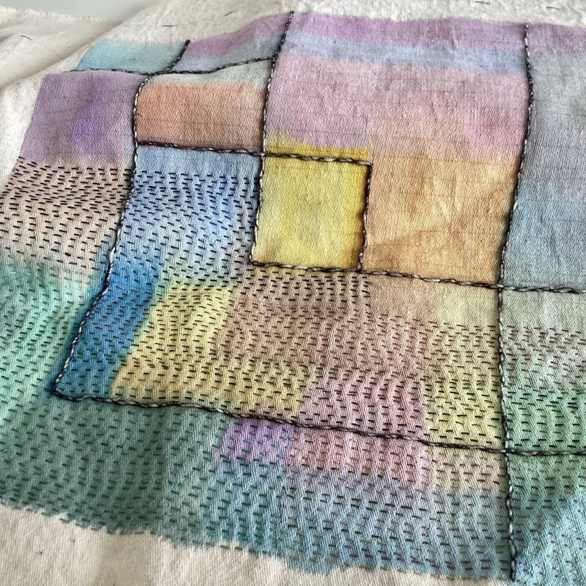
The second is a scrap of vintage linen/cotton sheet, painted with watercolours and then stitched. You can see the imprint of the embroidery frame which kept the fabric taut just while the paint was drying. I will soak and stretch the creases out at some point.

A row of little trees, painted area about 3.5” square
Birdie is looking a little scruffy this season

This sketchbook (so far) is just for me, and just for fun. I’m not sure it’s leading anywhere, although really everything is good practice for something.

Two stitched samples inspired by Klee’s Oceanic Landscape

I’m having a few days away from the day job next week and am looking forward to a break. I have a strong need to paint – who knows where these directives come from? I think it’s probably important to listen, in any case – so will be on paper for a while. Just to see what happens.

Klee sketchbook

Sketchbook cover, Klee’s 1922 painting of a little fir tree. Layered sheers and hand-dyed fabrics with simple hand stitch and applique

The sketchbook cover is finished – despite all the careful measuring and re-measuring along the way, I am always really surprised when it fits.

12” square sketchbook with cover

I have sketchbooks in various sizes, mostly made from papers that I collate and bind myself. This one is a bought spiral bound 12” square one, which is a good size for exploring mark-making and for holding samples of stitched work.

First page: A Klee medley, or Klee’s best bits
Sketchbook page exploring blocks of colour

‘Coming to bloom’ is a pastel drawing made by Klee in 1934, on black paper. I made a quick sketch with pastels, also on black paper – the fixative has dulled the colours a little, so I made a duplicate sketch in watercolour on a white background.

Then the fun really started. I made a little stitched sample on a scrap of black cotton fabric, only about 4” square or so, exploring ways of creating stitched blocks.

4” square sample. From the left: needle weaving with hand-dyed threads; rough satin stitch with 2 strands of DMC floss; sketchy long and short stitch with one strand of DMC floss

I really like the woven blocks. The satin stitch blocks have floats that are too long to be practical, but I also quite like the irregular sketchy effect of the straight stitch sample on the right. I worked the samples from right to left, so the weaving was the last thing I did.

Stitched sample on sketchbook page

Not quite sure where all this is going, but then some journeys are about exploration and discovery rather than arrival.

Little stitches

Making some progress on the Klee sketchbook front cover, based on his painting ‘Small Picture of Fir Trees’. I upgraded the blog and apparently I can upload videos now – this is just a little test to see what I can do.

A little seed stitching

I have a very small piece of hand-dyed silk net, which is one of the most delightful (and expensive) fabrics you can handle, and I’ve been saving it for a special occasion. I decided this was the occasion. I’m using an eco-dyed stranded floss from Arlee on layered organdie, silk organza and net.

I don’t often use a frame but seed stitching is easier this way. I also want to scatter stitches across the surface so it’s good to be able to see the whole thing.

Hand dyed silk net and silk organza

The sun is a raw-edge circle of loose-weave cotton scrim, covered with very sheer chiffon – a type of shadow applique, I guess, since the cotton circle is secured underneath the sheer.

In progress

Video, though. Imagine the possibilities!

Klee sketchbook cover

I finished my painted/stitched version of Klee’s painting ‘Clarification’, which is part of the cover for a sketchbook. I’m fascinated by that solid line across the lower third, which also features in the original painting, and somehow ties the whole thing together.

Paint and stitch based on a section of Klee’s ‘Clarification’ (1932)

I decided though that this is going to be the back cover, not the front, so there has been a bit of cutting and splicing.

Moving the front to the back

I’ve kept the seam on the right side because I’m going to cover the spine area later so the raw edges will be covered. The sketchbook is a 12” square spiral bound one, so I didn’t want the raw edges on the back interfering with the wire spiral, and I didn’t want the bulk of a turned seam.

So now I’ve started on the front cover, which is based on Klee’s ‘Small Picture of Fir Trees‘ (1922). I did a sketchy collage just to understand the colours and shapes and used a view finder to isolate a square area.

Klee’s ‘Small Picture of Fir Trees’ 1922

I’m trying this one in layered sheers and semi-sheers, with a base of hand-dyed cotton organdie and bits of silk organza over the top. You can just see the outline drawing underneath.

Sketchbook cover in progress

I really like layering sheer fabrics. I used to use them a lot; less so these days but it’s maybe something I might revisit. I like the way they are solid and transparent at the same time.

Pile of hand-dyed sheer fabrics – organdie, organza and chiffon, with some net and vintage sheer scarves
Building up the layers

The best bit is putting in some tacking stitches to get rid of the pins, which will be my next step. Then you can see much more clearly what you’re dealing with. Less hazardous too. I don’t know why, but I am always surprised by how sharp pins are. Makes me feel like I’m maybe not the sharpest pin in the box.

Immersion

One of the perks that comes with working at a university is free access to an academic library, and last week I found this:

Paul Klee Notebooks Vol. 1

You can read it free online, actually, but I prefer books to be on paper. I like leafing through pages and don’t like scrolling up and down a screen. It was good exercise carrying it home too, so twice the benefit.

I’ve had a completely free weekend so have been immersing myself in Klee and his life and works.

Notes

Having started to read his words, I feel I am beginning to understand him and his work better. Weirdly, I understand myself better too. I periodically berate myself for not drawing more often (what kind of artist doesn’t draw?) but then I read Klee and feel more validated about valuing process over object and trying to explore the intangible. I admire people who can draw with photographic realism but learning how to do that doesn’t really interest me. I don’t want to draw what I can already see. Klee famously said, ‘art does not reproduce the visible but makes visible’. And I guess I draw with a needle and thread instead of a pencil.

Klee’s writing is, as you would expect, pretty dense, so in between nibbles of philosophical art theory I’m working on a sketchbook cover. I accidentally deleted the photo I took of it in progress, so this is just a screenshot:

Watercolour on loom state cotton, inspired by Klee’s painting ‘Clarification’ (1932)

It’s just regular watercolour on fabric. It won’t ever be washed so it doesn’t matter about fixing the colour. The fabric I’m using is loom state cotton, and it’s a really good surface for sewing on. It’s not quite as thick as furnishing fabric, but a bit more substantial than heavyweight calico, and a nicer weave than cotton canvas – it’s quite a fine twill weave, similar to impossibly lightweight denim, if there could be such a thing. I’ve started to add rows of running stitch in threads similar to one strand of DMC floss.

The colour seems to be fading slightly already, but that’s ok. I thought it was a bit too bright to begin with anyway. You can see how I’ve had to draw lines on it to keep me on the straight and narrow and not go wandering off on a tangent. I’m not keen on the way the yellow square has ended up being more or less right in the middle, but it’s never going to end up on show anywhere so I can overlook that I think.

Front cover of sketchbook in progress

A play day with Klee

Firstly, thank you so much to everyone who has purchased fabric and thread – it’s now all on its way to you. I hope it arrives soon and that you can do something lovely with it.

I’m back in the day job from tomorrow so I’m having a little me time today, working (playing) in the second of two sketchbooks I have on the go at the moment. The first sketchbook is about ancient marks, standing stones, and lines on the land. The second is a study of work by Paul Klee, one of my favourite artists. I have often registered the affinity that Klee’s work seems to have with textiles. One of the first textile wall hangings I ever made was an interpretation of Klee’s ‘Fire at Evening’. Many of his paintings are basically patchwork, and many of his drawn lines look very like stitched marks.

Sketchbook page in progress

This painting looks exactly like a stitch sampler to me, and reminds me of my own stitch journal.

Paul Klee, ‘Rhythms of a Plantation’, 1925
Drawing based on Rhythms of a Plantation, 1925, 10” square

The marks on Klee’s painting ‘Clarification’ also look exactly like running stitch or kantha stitching.

Sketchbook page, watercolour and pencil, exploring lines and marks

What particularly interests me about Klee is his work linking painting with music. He thought of music as having similar principles to painting, particularly in terms of composition – and of course we use the same word to describe an arrangement of musical notes and an arrangement of painted or drawn shapes on a page. I like the layering in his polyphonic works, which are usually a series of regular painted marks over a patchwork-like background. To me this is very like a quilt – the patchwork ground tells one story, and the quilted lines on the surface tell another story, like two voices singing in harmony.

‘Ad Parnassum‘, Paul Klee 1932

The stitched sample is an exploration of how tiny bits of fabric would look if applied to a textile surface. I’ve used felt in this first foray, simply because it’s easy to cut up into small pieces and it doesn’t fray. I’ve experimented with different ways of attaching the little tiles (for scale, the bits of felt are about a quarter of an inch square).

Tiny pieces of felt applied to vintage linen

Probably my favourite is the invisible method (top right), but I’m not confident that it would be stable enough. I took the needle and thread horizontally through the centre of the felt, like threading a bead, and then down into the base fabric. I suspect over time it might split the layers, in which case the top layer could peel off.

Whether any of it works or not is immaterial today, really. It’s just nice to have some time to think about the possibilities.