Quilting time

You might remember this that began in June. It’s taken five months to put it together, in between other things, but it’s now one complete square, about 37″ or so.

removing the basting stitches – always the best job

I hadn’t originally envisaged ‘proper quilting’ it – as in backing, batting, and top, but somehow that just happened. Normally I would just have used a top and a backing. My batting of choice is Hobbs Heirloom wool, which is lightweight and very easy to quilt; I’ve never got on well with the cotton or polyester battings. The backing is cream cotton calico.

making a start

It’s very pale, and very neutral, and I’m currently undecided about whether that’s a good thing or a dull thing. It’s definitely quiet, and I like quiet. And it’s winter, which is a good time for quilts and quiet.

The circular outline (couched, black and cream silk bourette yarn) is a little thin, and the quilting so far is probably a little small.

silk bourette circular outline

But it’s a start. For now, it will rest on the chair while I look at it a bit more.

Gutermann cotton 12 thread

My problem generally, and this applies to painting as well as textile art, is that I usually like backgrounds as they are. I often have trouble adding the requisite focal point because I don’t want to obscure the background.

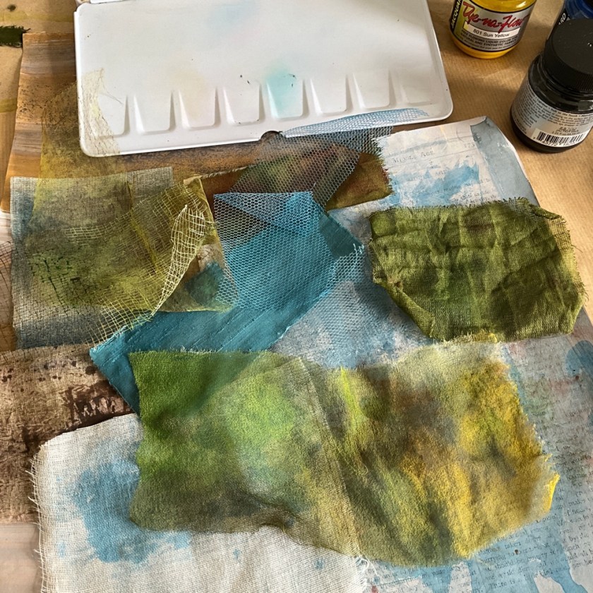
This little quilt has some really interesting patches, some of them made from layering sheer fabric over another, like this tea-dyed silk with a layer of dress net over the top:

layered patch, silk and net

And this vintage cotton with textured nylon chiffon over the top:

layered patch, cotton and spotted chiffon

I don’t want the quilting to trample all over the piecing and the more interesting patches, but I do need to quilt all the layers together securely. I may try tying the layers here and there. I think it just needs to sit on the chair for a bit while it thinks about what it needs (don’t we all!)

The sketchbook I’m plotting this (and others) in is an A4 landscape-format book, one of my favourite layouts.

Remember sketchbook

Everything in this sketchbook is about remembering, recollecting, and forgetting. There are spots of time, there are ghosts (from time past), there are attempts to turn something intangible and unfathomable into something visual and tactile. There are shadows from time past, and there is the light of time present.

sketchbook page

The thinking and the testing is all part of the finished thing.

sketchbook page

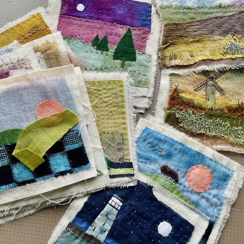
Today I will be mostly looking at a small quilt as it rests on a chair. And yes, I call that work now. It’s ridiculous really.

book cover (3)

Anyone bored with sketchbook covers yet?

Look away now, if the answer is yes 😎

This one is A4 size, and it’s the sketchbook I’m using for the Laura Horn Modern Mixed Media course. So far the course content is quite different in style from what I would normally produce, but there are some interesting techniques that I might be able to adapt into some kind of landscape work. Laura is very, very good at what she does, and she demonstrates the techniques expertly.

The cover for this one is mostly layered sheer fabrics – hand-dyed silk organza, chiffon and nylon tulle, on a plain calico base. I drew some loose scribbly marks and lines on the calico first, which you can just about see under the surface, and then layered the sheers over the top to form a kind of landscape.

sketchbook, front cover

The scrap of poetry on the front cover, held in place under the top layer of nylon chiffon, is from ‘Home Thoughts in Laventie’ by Edward Wyndham Tennant.

The back is a little more simple, but broadly the same technique:

sketchbook back cover

Sheer fabrics are notoriously difficult to photograph, so some of the colours are not quite right here – textiles always look so much better in person, in any case. This detail of the back cover shows some hand-painted builder’s scrim under the top layer of chiffon.

back cover, detail
front cover, detail

As usual, I’ve made a wrap-around slip cover, so the inside covers do double duty as pockets.

inside front cover

The Modern Mixed Media course so far has been quite heavily focused on ‘botanicals’, which I’ve struggled to render on paper without it looking like someone else’s work. The best I’ve been able to do so far is a kind of scribbly variation, which I quite like.

scribbly botanicals, pen and ink/watercolour

I’m not terrifically impressed by the paper in this sketchbook, which is a Fabriano watercolour 200 gsm. The paper has a very prominent texture, which I find distracting. You can see it particularly clearly on this page:

sketchbook page

I’ve taken to collaging the pages before adding any paint, which I’m finding easier to handle.

sketchbook page, collaged with vintage papers

This page is ready for something, though I don’t know what yet. I could easily say the same about myself, most days. Let’s see what the rest of the week brings.

Book cover (1)

I’ve been having a tidy-up in my workroom and trying to round up All the Sketchbooks. Turns out there are a few more than I thought.

some sketchbooks

Some are complete, some are nearly complete, and some are completely empty. I do like a well-dressed sketchbook, so you know what’s going to happen next.

I have a little 6″ square Seawhite sketchbook (140 gsm cartridge paper) where I put paint scraps – leftover paint from another project, not enough for a new thing but too much to pour away. Then I go back in and add marks/other media, with no real plan. However hard I try to keep each sketchbook to a theme, they always end up being a fairly random collection of colours and marks.

6″ mark-making sketchbook

The cover for this one is made from hand-dyed silk organza and dress net, roughly cut into circles and rings, layered onto some plain calico. Then I’ve covered it with very sheer nylon chiffon and stitched some simple lines and marks over the surface to hold it all together. I’m very bad at stitching text so I’ve sandwiched a small piece of handwritten card on the spine between the chiffon and some net.

mark-making sketchbook cover (back)
mark-making sketchbook cover (front, detail)
mark-making sketchbook cover, in progress

If anyone’s interested in the contents, here are a few pages showing how simple it can be:

watercolour and acrylic ink with pen
watercolour with 8B pencil sketch
exploring colour and patterns

I recently got some Roman Szmal watercolours to try, just a starter set of five, and I really like the Caput Mortuum and Aquarius Green:

Roman Szmal caput mortuum and Aquarius green with fine black and white pens

Mostly this book (so far) consists of various rings and circles, hence the design on the cover.

watercolours with walnut ink, marks made with cotton bud (q-tip) and cocktail stick
watercolour with Derwent drawing pencils

There are lots more books needing covers, so there’s more than enough here to keep me busy over the coming months. If you’re in the northern hemisphere, do you have long/ongoing projects planned for the coming winter?

Sketchbook Revival

Quite a few links in this post; I hope they all work.

Firstly, a huge thank you to Fiona, who told me about the free online Sketchbook Revival course hosted by the wonderful Karen Abend. I’ve been following along, and it really has been an exciting and inspiring two weeks. If you missed it, I think the classes are still available for another couple of weeks or so. And another huge thank you must go to all the amazing artists who so generously shared their time, experience, and processes.

I kept a sketchbook (more of a notebook, really) to remind me of the content, and I had a go at most of the projects – some more successfully than others, but then you generally learn more from your ‘bad’ art. I stayed pretty close to the techniques and images presented, but made enough notes to be able to attempt something similar in my own style, and I think I’m still learning what that is. Shown here are just a few examples; this particular book is actually full-to-bursting now.

Sketchbook Revival 2024 notebook, front cover

I added pockets to the notebook so I can write extra notes to myself. I have a lot of sketchbooks, most of them constantly in progress and nowhere close to being finished, and I often struggle to find enough time to use them meaningfully.

As Karen Abend so wisely says in the last session, however passionate you might be about your creative practice, it can be very difficult to be consistent with it, and it’s true – life gets busy; often I don’t know what to do in the sketchbook so I end up not doing anything in it; and then there’s the potentially overwhelming problem of the inner critic and imposter syndrome. After these two weeks of brilliant classes, I’m more determined to maintain a daily sketchbook practice. There are lots of mixed media ideas I want to explore, and I can now promise myself that I will find the time for it.

inside back cover, pocket (envelope) for notes to self

Usually these days my drawing consists of abstract mark-making, and it’s been a while since I’ve drawn ‘things’ that can be recognised as themselves, although lately I do seem to be drawn to flowers and leaves. A few of the techniques demonstrated in the classes are somewhere between abstract and realistic. I really enjoyed this poppy meadow session, hosted by Tamara Laporte:

watercolour poppy meadow

There was mark-making by Joy Ting, using twigs as drawing tools – I already do this quite often myself, and it’s been reassuring to see and hear artists voicing my own thoughts about processes, using similar techniques.

trees drawn with sticks dipped in walnut ink and acrylic ink

There was a bit of mixed media collage, with Lynissa Hayes:

mixed media collage page

And some proper drawing – upside-down thumbnails hosted by Linda Germain:

upside down thumbnails (left) and how to draw anything (right)

The right hand page shows the exercise presented by the utterly brilliant Suhita Shirodkar, who demonstrates how to tackle a complex street scene, featuring architecture and crowds, in pen and watercolour. This one was a bit out of my comfort zone – not something I would even think about drawing, usually – but she makes it very accessible and it was actually a lot of fun.

And then there were mixed media pockets and tip-ins (not a term I’ve come across before; from the context it seems to be an extra page that you stick into a journal or sketchbook) hosted by Roben-Marie Smith, and also really enjoyable.

pocket for sketchbook page

And there was drawing over (and under) collage with Julie Fei Fan Balzer:

(deliberately) wonky teacup

There’s a LOT more in the course than the handful of examples I’ve given here – there are more than thirty sessions altogether. I learned a lot, had lots of fun, and am immensely grateful to all the artists who took part in this.

Next up, I’m doing a mixed media class with Laura Horn, and am looking forward to getting stuck in. Maybe it’s something about the autumn that makes me want to go back to school. It’s probably all those Septembers as a child, with a pencil case full of new pens…

Flowers

In my last post I mentioned the online course I was doing with Suzanne Allard, and that bright florals weren’t really my thing. Figurative painting – as in proper ‘doing a painting’ of an object, like an artist – isn’t really my thing either, for that matter. I’m usually happier with needle and thread and abstract marks.

And then I said to myself, who doesn’t like flowers? I had a go at some flowers with collage, which I find more approachable than painting. What I like about collage is that you can take some shapes and colours and move them around on the page before committing to anything permanent.

collaged flowers, mixed media

Like I said, flowers aren’t my thing, bright colours aren’t my thing, etc etc. And what do you know, I quite like it.

flower collage, mixed media

What are sketchbooks for if not to try stuff and have some fun?

I had a little go at painting leaves with a watercolour sword brush. Definitely need more practice with that, but it’s a really lovely brush.

watercolour with sword brush

And I really like the way the scrap of paper forming the centre of one of these flowers just happens to have the word ‘blooming’ on it.

blooming

My desk is looking a little chaotic, but I am having some serious fun here.

paper everywhere
watercolour with Faber Castell Pitt pen

If you’ve ordered threads and/or fabrics (thank you), they’re on their way. Rummaging in the stationery cupboard, walking to the post office, and playing in a sketchbook or three have brought me to a very happy place indeed this week.

Respite

It’s been a difficult few weeks and I needed a couple of days down time, so I’ve taken refuge in some no-pressure sketchbook work.

coloured pencil on acrylic/ink background

I’ve just started Suzanne Allard’s online course 31 Bright and Fun Sketchbook Paintings. I really like Suzanne’s calm and confident teaching style, and I also like seeing how other artists approach their work. The bright florals are not completely my thing but there are plenty of inspiring ideas and techniques to try, and it’s nice to sit back and watch someone else talk you through their approach to their art. And there’s always something new to learn.

My own sketchbook pages are nothing like the ones in the course, but I’ve been trying some of the layering techniques just for the fun of it.

sketchbook page
pen and Inktense crayon on acrylic ink background

Without really meaning to, I often find that my sketchbook pages are full of marks that could feasibly become stitches. Not really surprising, given that drawn marks are mainly dots and lines.

One of the things I’ve discovered is that I no longer enjoy using acrylic paints. The ecological aspect has bothered me for some time (as in acrylic=plastic) but having had a little play with them again I find that I really don’t like the slightly plasticky sheen.

sketchbook page background, gesso/acrylic

Layering or mixing acrylics with gesso makes them less shiny/glossy/plasticky. In the spirit of using what I’ve got, I’ll probably use my existing supply and then not replace them.

I do, however, like acrylic inks – also plastic, but I’m guessing not quite so bad as the paint. I like the inks because they behave like watercolour but they’re not water-soluble once they’re dry so you can easily go over them with other media without disturbing the base layer.

sketchbook background page: gesso and acrylic ink

The problem I have with layered backgrounds is that I end up really liking the base layer as it is and I don’t really want to add anything else on top of it. I’ve therefore ended up with a sketchbook full of nice backgrounds, which is also fine I guess.

I’ve had a little tinker in the watercolour sketchbooks as well.

watercolour mini-sketches

I used low-tack masking tape to divide an A4 page into postcard-sized areas. The marks on the top two were made by dipping a stick in walnut ink and drawing on wet paint.

I’m resolving to make more time for this as it’s something I really enjoy, and besides all work and no play etc. Wishing you an equally playful and creative weekend.

Immersion

This piece takes its title from Wordsworth’s 1804 poem ‘Ode on the Intimations of Immortality’:

‘Strength in what remains’, 15″ square

It hasn’t photographed well on this very dark wet Wednesday; the colours and layers are a little more subtle in real life.

Strength in what remains, details

The text fabric (above, top left) is a handwritten page from a nineteenth-century almanac that I scanned and printed onto tea-dyed cotton. If you iron fabric to a piece of freezer paper that exactly fits your printer (usually A4 in the UK), it’s surprisingly straightforward. I expected it to get snarled up and jammed in the bowels of the printer but it sailed through quite smoothly. I used to print on fabric quite often and had forgotten how effective it can be. If you set it with a hot (ish) iron after printing it appears to be reasonably water resistant, though I haven’t yet tried washing it.

Strength in what remains, detail of hand stitch and layered sheers

There are a couple more like this in progress, an ‘Intimations of Immortality’ mini-series, perhaps.

‘Something that is gone’ in progress

There’s also a heap of loveliness on the table that will be turned into something a little larger…

fabric and thread waiting for action

…related to more sketchbook exploration:

big plans

I am definitely busy.

Time Present

Recently I’ve been able to make a start on some new work, and the process of this modest beginning has been a truly joyful thing. I hadn’t realised how much I’ve been needing to do this.

current sketchbooks

So far, it’s about time, experience and memory. I’m beginning with the opening lines from T S Eliot’s Four Quartets as inspiration:

Time present and time past
Are both perhaps present in time future,
And time future contained in time past.
If all time is eternally present
All time is unredeemable.

What a vast line that is: All time is unredeemable. It’s irreversible and we can never get it back. The only time we can be sure of is time past, present in memory only.

The sketchbook I’m using for the wet media is a Fabriano aquarelle A4 sketchbook, 200gsm pages (no affiliation). Just firm enough for taking wet paint but not so stiff that the pages don’t bend.

Of course it had to have a cover:

watercolour sketchbook front cover
back cover (and I prefer the back…)

And some details from its pages:

sketchbook page, oil pastel resist with watercolour and ink
white acrylic ink as resist with watercolour wash over the top

new stitched work in progress

Mostly I’ve been exploring using watercolour, ink and collage. The above layered stitched work in progress is based on this paper collage:

collage, untitled

I’ve been doing very loose sketchbook work, which is a great thing. I like the way it can be more a physical than cerebral process. I like to paint standing up rather than sitting because it somehow enables you to inhabit the process more, and to move around over the page more easily. It seems to generate and capture more energy. Drawing and painting can involve your whole arm as well as your hand, making expressive abstract marks and laying down whatever colours speak to you in that moment.

These are four separate sketches (unintentionally four quartets, perhaps), using inks, watercolours, and basic mark-making techniques, with no preconceived ideas about where it’s headed or what it’s going to be. Not my usual colour palette, but each one valuable in its own way, and time well spent. Even if you make something you don’t like much, it’s always worthwhile because you learn something. I think all of these might translate to cloth and stitch.

watercolour and ink over masking fluid resist

Also some calmer blocks and stripes, just to see.

watercolour greens
time past, time present, time future

It’s exciting to see these colours, shapes and compositions emerging. It may or may not lead somewhere, but for now it’s enough in itself. I have much more to read, and more blank sketchbook pages to fill, and it’s utterly delicious.

Setting out

I’m feeling settled enough in our new home to think about starting some new work, and I’ve made a start in a spiral bound square sketchbook that I’ve had for a little while. Sometimes these things only speak to you when they’re ready.

Of course I had to make a cover for it, as I do for most of my sketchbooks. I find it helps to illuminate some of the themes, as well as providing a little extra protection for the contents.

The cover wraps around the spiral binding and meets itself on the front. It’s not my usual colour palette:

wraparound cover for square sketchbook

I’m using a Two Rivers plein air pocket sketchbook, which has alternating pages of watercolour paper and cartridge paper. The pages are about 7.5″ square, so a nice manageable size.

sketchbook cover

I like pockets in sketchbooks. Actually I like pockets full stop. In my youth I went through a phase of wearing men’s vintage jackets purely because of the number and quantity of pockets, which utterly delighted me. I would keep finding extra hidden pockets all over the garment, inside and out. We no longer say the word pockets in our house. We always say pocketses, a la Gollum in The Lord of the Rings.

pocketses are great

I’ve been using the watercolour-paper pages for direct painting, and the cartridge-paper pages for collaging.

So far it’s all very loose and sketchy, blending colours, shapes and words. I’m cutting the words from an old poetry anthology to create found poems, which is helping to navigate the direction.

ink and watercolour on TwoRivers watercolour paper

I don’t know exactly what it’s going to be yet, or where it might be going, but between us (me and the work) we will find a path. Or maybe this is enough. I think it’s leading somewhere, as most things do.

sketchbook page: be prepared

Some of it is already looking like textile work.

probably the beginnings of a quilt

This page is just ink on wet paper with salt sprinkled over it. I enjoy the unpredictability of this kind of work. Play, really.

ink with salt

It’s a voyage of discovery as always, exactly like life. Travelling through time, we never know what will happen next. And yet, on we go.

Painting the land

Recently I rediscovered some work from a couple of years ago, from the pre-blog 100 Days of Winter series (all the pictures are buried on Instagram if you can be bothered to go back that far. 2019/20 I think it was). I sold some, gave some away, and still have a few left, which I’ve started reworking.

Work old and new, 4” square

I’m in the process of writing/creating an online course showing how to make these, and spent an engaging hour or so this morning experimenting with colouring some fabric scraps.

Painting some scraps

I’ve used watercolour, acrylic ink, and Dye-na-Flow fabric paints. An additional extra was accidentally creating some collage paper by using painted paper as a drop sheet.

Drop sheet collage paper
Blues and greens, land and sky
Sketchbook page with scraps

Still thinking it through. Learning all the time.