In the UK when you buy a house, it’s all very exciting at first but then there are weeks and weeks where nothing happens. The buyer’s and seller’s solicitors are all busy doing land searches, drawing up contracts, and asking each other questions. In the meantime you can’t do anything because there aren’t any dates for exchanging contracts or actually moving. Until contracts are exchanged, the buyer or seller can change their minds and withdraw at any point. It’s quite stressful even before you start packing.
So, for now, it’s a question of being stoical, trying to keep calm, and carrying on.
This doesn’t look any different, despite hours of work. Another case of art reflecting life.
hedges in progress
It is actually quite calming.
hedges and boundaries
I made a repeat pattern based on the fields and sampled it on a little zipper pouch from my RedBubble shop:
zipper pouch
As a result of seeing it in real life I tweaked that weird wedge-shaped field/hedge and re-uploaded, so the current design looks slightly different. Better, I think.
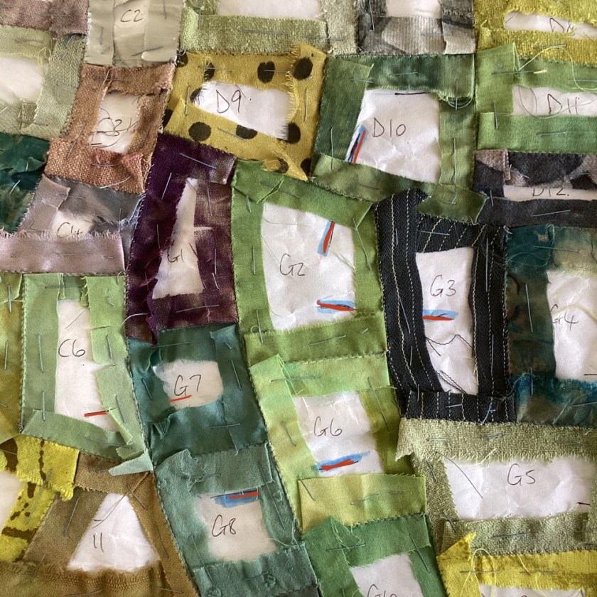
Probably my favourite colour, which is just as well because this is all very green indeed. Curiously, my camera doesn’t seem to like it and refuses to accurately render the colours. I can only say it’s much nicer in real life. Textiles are notoriously difficult to photograph in any case because of the way they hold and reflect light.
I’m starting to add some hedgerows between the fields, with silk boucle and various textured yarns. Just couching along the seams. I tried a few colonial and French knots but had to unpick most of them. You wouldn’t see that much detail from that high up, I don’t think.
As usual, simpler is better, and the textured yarns seem to be holding the lines ok on their own.
box of luscious textures with Valdani perle 12 threads
I’ve layered the patchwork over a piece of brushed cotton (cotton flannel) and backed it with an old hand-dyed cotton tablecloth, with the outer edges turned in over the mid layer so that the irregular edges of the patchwork will sit on the surface. Technically it’s a quilt, having three layers, but the brushed cotton is less dimensional than wadding (batting).
on the edge
I’m finding it difficult to get myself motivated at present, with the house move looming (though we still have no dates yet), so stitching hedgerows is quite a nice soothing activity for these uncertain days.
Not quite a square yard – it’s about 32″ x 34″, and all pieced together now. Some people think English paper piecing is too fiddly and takes too long, but I find it fairly quick and very enjoyable. I’m already thinking about a bigger, bed-sized version.
slightly blurry picture, but you get the idea
All the curves went together just fine, after I added the balance lines.
look at that lovely curve
The best part of English paper pieced patchwork is removing the tacking thread and papers, when all the piecing is complete. The cloth starts to relax, and you can see what you’re working with.
some of the tacking and papers removed
Much nicer to handle, and the colours seem to come alive more.
A few more to go, then I need to think about how to back it, line it, or quilt it. Haven’t decided where it’s going yet. There will probably be textured yarns couched along some of the boundaries and of course some stitch here and there. Maybe even some tiny sheep.
some tacking still in, some already out
Initially this was going to be a PDF pattern but I think it might be a bit too complicated for that. There is quite a lot of tweaking and easing, to get the curves to lie correctly and line up the balance marks, which is easier to do than to explain. Maybe a PDF for the intrepid.
I anticipate that this may well be the last thread update before Christmas, as our house move may or may not happen before then. Everything is still very up-in-the-air at this point. Good job I have the patchwork to keep me grounded.
You might recall the patchwork I started last month, using my proposed 2024 stitch journal template to piece together an aerial map of fields:
false start
I got so far with it and then hit a slight problem: having pieced two A4 sized blocks together, it became clear that none of the next A4 blocks were going to fit properly. My mistake entirely – a couple of mistakes, actually, and schoolboy errors at that. I had failed to read the plan before stitching, so mis-aligned the outer edges, and I hadn’t marked balance lines on the template for accurately joining the curves.
It was less work to start again than to unpick, so I’ll use my false start as a practice piece and then will probably turn it into a sketchbook cover, so nothing is wasted.
So for attempt no. 2, I added balance lines to the template.
balance lines (in red) for piecing curves
Piecing curves is tricksy and has to be accurate, particularly when a lot of separate pieces are involved. You can see how this works:
balance lines in action (in blue/red)
It’s just an extra insurance for making sure everything is going to fit correctly later on. If the balance marks don’t join up on either side of the seam, then you know you’ve gone a bit wrong.
curves fitting nicely
The second thing I’ve done differently this time is piece the thing in irregular sections rather than A4-sized blocks, and it seems to be working better.
sections completed
I’ll wait until each section is finished before joining them all together.
fitted but not joined
It’s probably about half done, and is continuing to come together quite nicely. At this stage it’s still very portable so is an easy and relaxing thing to work on in the evenings.
box of tricks
I only roughly planned the colours (as in all of the M section will be greens and golds, the A section was greys and browns etc) so it’s a nice surprise to find out what ends up sitting next to each other. Keeps it interesting. And I always think patchwork is a kind of piecing together of life’s problems too, and finding a solution in the whole. Art, stitch and therapy all at the same time. What’s not to like?
I’ve been having a go at designing next year’s stitch journal template. A bit early to be thinking about that, I know, but the way this year is speeding by I thought it best to make a start.
It will be slightly different from the last two years, in that next year’s daily stitching will be a big square (ish) rather than a long strip. I’ve designed it across twelve pieces of A4 paper that all have to fit together to make the whole thing, so it’s a reasonably complex task that is still very much in progress. I’m imagining that it’s a map of the coming year, in the form of an aerial view of fields.
I *think* it will work. I have yet to print it, to try cutting and re-assembling the separate pieces for myself, but once I’ve done that I’ll aim to make the template available before the end of the year.
As I was looking at all twelve pages glued together to make the 36″ square, I found myself imagining how it would look in fabric as patchwork.
These things often start out as idle wonderings but sometimes they gather momentum while you’re looking the other way and before you know it, you’re cutting out tiny bits of green fabric and the thing has begun.
patchwork shapes
The thing about English paper piecing (piecing fabric over paper) is that you can do it with any tessellating shapes, however irregular they might be, and I had a whole tableful of tessellating shapes waiting to be something.
I took a photo of the master template and added colour on Procreate, a digital drawing app. I envisage this as fields through the seasons, so the outer edges will be greys and browns, while the central area will be more vibrant greens and golds. That’s the plan so far, but the best thing to know about plans is that they can change completely at any moment.
patchwork in progress
I used to do a lot of patchwork, and it’s still one of my favourite things. I love the way it holds the connections between fabrics, time, and memory. I can identify every fabric here as the old friend each of them is – some from clothes that wore out; some from an old bed sheet that became a dust sheet and was later torn up and dyed; some vintage fabrics, found and dyed.
birdie is slightly startled by the sudden change of planprogress so far, about one-sixth of the whole
What started out as a map for next year has gone sideways into a whole new adventure.
It will still be a stitch journal template as well, but what fun to make two different things out of the same design.
We had a day out at the seaside recently, revisiting the East Yorkshire coastal town where I grew up. I’ve always liked the seaside colour palette – aqua blues, sandy browns, sky blues and whites – and I set about assembling some patchwork to cover a spare pillow in my workroom.
patchwork in progress
I generally use the freezer paper method for English paper piecing (google it if you’re not familiar with this, there are lots of tutorials and instructions out there). This design is based on a little paint sketch I did a couple of months ago:
watercolour sketch
It all came together fairly quickly. I didn’t want to stitch on it much because the fabrics are really beautiful in themselves – scraps of textured silks, vintage linens, and vintage/handwoven cottons.
hand pieced patchwork
I found a bit of old black soutache braid, which I used to emphasise some of the seams. I quite like the Mondrian-esque effect.
Mondrian went to the seaside
And after a couple of days, a new pillow cover. The back is just tea-dyed calico, simple envelope style, so there are no zips or fastenings.
Initially I thought I could just slide a lining fabric underneath to stabilise it and then darn the surface, but it really was beyond repair on closer inspection. The only thing for it was to disassemble the section and replace the fabric.
Deconstruction
The whole cushion, pieced top and envelope back, is hand stitched so there was a fair amount of unpicking. I’ve been able to salvage parts of the silk for other projects, but have replaced the panel with a lovely piece of eco-printed cotton from Jane Hunter textiles and a piece of textured silk fabric from The Silk Route.
Repaired and renewed
I’ve got a few days off from the hectic day job this week, and had been feeling pretty much like that shredded silk. It feels today as if I have repaired myself a little as well as the cushion. I think when cloth and thread are part of your soul and identity, the simple act of repairing something with needle and thread becomes very restorative.
Eco-printed cotton and textured silk
Quiet time is exactly what is needed this week. Nice to have my favourite cushion back in service too.
I hope no one’s bored with book covers yet. I’m making a cover for a 12” square sketchbook – though I expect it will be more of a notebook, really, with drawings. Somewhere I can jot down ideas and designs for Red Bubble.
Book cover in progress
I’ve always enjoyed seeing red and turquoise together. It started me thinking about the concept of clashing colours, and I’m not sure that I agree there is such a thing. In my experience, you can generally put any two or three colours together and they will sit side by side fairly happily. Red seems to go with pretty much anything; so does purple. I think there is the potential for a problem when you put too many different colours together, but even then you can generally tone them down by adding some black and white.
Front cover, about 12” square
The main problem I’m having is trying to get an accurate photograph. If the red is right, the turquoise is wrong, and vice versa. Suffice to say the colours are richer and deeper in real life.
Moon flowers
The design initially started with the red circle, which is a piece of shot silk from an old sari layered over a circle of felt. I was going for a fairly obvious red bubble, but then the little flowers popped up and it’s turned into a kind of moon flower arrangement. These things happen. I find the thing that grows organically in its own way is usually better than the thing I was aiming for. You just have to trust the process sometimes. The turquoise background is pieced together using strips from the edge of a hand-dyed vintage tablecloth. You can see the creases, which formed the edge of the cloth where the fabric had been doubled. They won’t iron out, and in any case I quite like these scars from a previous life.
And then I found a piece of really ugly fabric. I don’t often have dye disasters, but this poor thing was definitely one of them. Usually you can rescue a disaster by over-dyeing it, but I think this one has been over-dyed a few times and never looks any better.
A dye disaster
But actually it looks ok here. It looks as if it has found its place in the world. Maybe ugliness is as much in the eye of the beholder as beauty. Maybe there is even no such thing as ugly. Beauty is, after all, one of many problematic cultural concepts that just excludes the non-conforming. It’s not exactly a match made in heaven, but then most of us can rub along ok with most people most of the time. Perfection is virtually unattainable. I will settle for OK on this occasion.
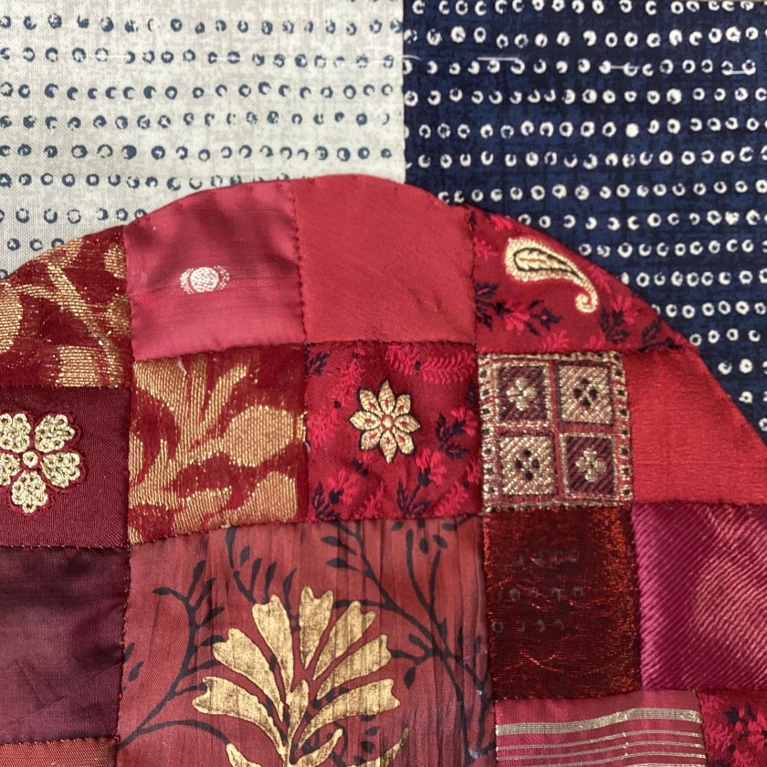
The back almost made itself. I already had the patchwork circle, pieced a while ago when I was gathering together some scraps of red print. These are mostly shiny/glitzy silk and satin, fabrics I wouldn’t ordinarily use much. But put them together, cheek by jowl, and they seem very happy.
Patchwork circle, paper-pieced, about 9” diameter
I often think auditioning fabrics to see which of them looks good together is a bit like sending them on a blind date. Sometimes they instantly find true love, and sometimes they never want to see each other again and end up back in the drawer. Eventually there will be something for all of them, even if that turns out to be solitude. Some fabrics don’t need others; they do just fine on their own. Some need company. Sometimes which of them ends up together is more luck than judgement.
The Covid Chronicle, founded by Wendy Bliss, is a community textile art installation, currently touring in the UK. It comprises about 140 panels worked in a range of textile art techniques and records contributors’ experiences of the pandemic since the first UK lockdown. You can see the work here from today until 19th June, and from July it will be on display at Riverside Studios, near Hammersmith Bridge.
The Hammersmith venue has a huge window space that isn’t suitable for the textile art because it gets too much light, so contributors have been invited to make hearts that can be displayed there a bit like the Wall of Hearts.
I already had a couple of patchwork hearts lying around in a drawer so it was quite easy to put these together.
Patchwork heart on layered background 9” x 12”
I really like layered sheers. I like the way they reveal as well as conceal, the way they cover the background but you can still see through them if you look closely. And of course we are all like that too. Very few people get to see through all our layers.
Layered linens, silk organza and silk chiffon
The other two are slightly smaller, about 6” x 8”, and are made with eco-dyed fabrics from Jane Hunter.
Pair of hearts made from linen, cotton and wool
The white heart is just strips of cotton fabrics pieced together into a heart shape, with some decorative stitching over the seams.
Strip of silk chiffon covering the edge
I really like the scrap of eco-dyed felted wool – it’s quite thick and substantial, I’m guessing from an old wool blanket, and perfect for this. It always amazes me how these orphans and scraps find their home eventually.
Eco-dyed wool with vintage cotton lace and little seed stitches
These will be travelling to Wendy very soon, and if you’re in London in July maybe you could go and visit.
Its working title was ‘All Together Now’ but I found that gave me a constant earworm of the song with the same name, which became distracting, so it had to go. I dropped the outer words and have named it simply ‘Together’. I like the etymology – it comes from an Old English word meaning ‘to gather’ – and that’s exactly what this quilt is. It’s a gathering: of fabrics, of textures, of colours, and of time.
‘Together’ 66″ square (121 x 6″ blocks)
I have a perennial problem with making large quilts. I like working on a large scale, as a rule, but when the thing is finished I have no way of taking a decent photograph of it. I don’t have a wall big enough to hang it on (in any case, there is no hanging sleeve on this one). Usually what happens is we have to move the furniture out of the dining room, lay the quilt out on the floor, and then climb up a stepladder, hold a camera out at arms length over it and hope for the best. Textiles are very difficult to photograph at the best of times and always look so much better in real life.
Seed stitching across the central panel
The quilt is made entirely of scraps and leftovers, hand-pieced over paper using the traditional English paper-piecing method. I assembled the blocks as 6″ squares, using patches in multiples of 1″ (so for example, 1 x 1, 1 x 2, 2 x 2, etc). I then arranged the blocks by colour group, with the whites and neutrals in the centre. The fabrics are an immensely eclectic mix of very modern and very old, plain and patterned, textured and plain-weave. The oldest pieces in it are from the eighteenth century, and they sit happily next to very modern scraps and samples. Most of the fabrics are hand-dyed vintage cotton and linen, with some over-dyed modern quilting cottons. There are a few synthetics and satins in there as well. I don’t normally like shiny fabrics much but I do like the way these little squares catch the light.
The blue cornerThe red corner
The seeding stitches in the central panel create circles of negative space. Initially this was just a design decision to disrupt the straight lines created by the square blocks, but now I can see that the circles create little oases floating like bubbles across the surface. I like the way the circles are distinct but at the same time visibly still a part of their foundation.
Lots of seedingspots of time among seeding stitches
The middle layer of the quilt is cotton flannel rather than traditional quilt batting, only because that’s what I had. I didn’t want to have to buy anything for this one. The backing is pieced together from a vintage silk sari. The quilt is thin but quite heavy.
Quilt back, pieced from patterned silk sari
I am a little nervous about the longevity of the quilt. It’s designed to be decorative rather than functional, but not to hang on a wall. I imagine it displayed on a bed, ideally. I don’t know the remaining life span of the silk backing: silk tends to tear very easily as it ages, and I’m not sure how old this sari is. The quilt isn’t washable, due to all the different kinds of fibre – the very elderly patches will shred, and the hand-dyed fabrics might not be entirely colour-fast. The seeding stitches on the surface would be quite easy to pull and distort accidentally. Its new owner (when I find them) is going to have to be very careful with it. But then, very few things last for ever.
Quilt label made from embroidered vintage linen, hand-dyed. I really like the way those two embroidered arms reach out to each other.
I did think about whether it needed some sort of additional circular pattern in the outer borders, but in the end I think there’s probably enough going on in it. I’m looking forward to being able to start something a little more manageable.