Still achromatic

Probably a better descriptor than ‘monochromatic’, since the latter could feasibly be any single colour. You can probably see how much I’m still enjoying my achromatic sketchbook – basically all just black and white, exploring compositions through painting, drawing and collage.

murmuration, pen and watercolour on cotton paper

I’m using two shades of black (ivory black and mars black), white, and buff titanium. I’m also allowing myself a little Payne’s grey and Goethite (a subtle warm sandy colour) here and there – probably a little outside the black and white rule but then I make the rules so I can also break them.

watercolour on soft cotton paper
colour palette and pebbles

I gathered together a wide range of substrates when I made this book, including canvas, cotton rag paper, cartridge paper, watercolour paper and handmade papers. Each one takes paint and ink slightly differently, making this sketchbook perfect for all kinds of exploration.

pebbles, painting (left) and collage (right)

I’ve also used plain black india ink here and there.

ink on canvas

And some collage:

collage from magazine papers with text
layered papers with text

There’s some figurative work (or play) too. I like birds. I think the ability to fly would be my superpower if I could choose one.

Raven, coloured pencil on watercolour background
Magpie, coloured pencil on watercolour

Something a little looser:

crow, black ink over watercolour

I also created some printed/stamped papers that I’ve stuck in here and there.

watercolour (left) and hand-printed paper (right)

Today I’m looking through some fabrics to make some textile/stitched samples.

black and white fabrics and threads

I’m actually starting to run out of pages, and I can easily see the attraction of a second volume. I would never have expected black and white to be so interesting and engaging. Just proves the value of venturing outside your comfort zone and having a go. I do like a creative adventure.

Respite

It’s been a difficult few weeks and I needed a couple of days down time, so I’ve taken refuge in some no-pressure sketchbook work.

coloured pencil on acrylic/ink background

I’ve just started Suzanne Allard’s online course 31 Bright and Fun Sketchbook Paintings. I really like Suzanne’s calm and confident teaching style, and I also like seeing how other artists approach their work. The bright florals are not completely my thing but there are plenty of inspiring ideas and techniques to try, and it’s nice to sit back and watch someone else talk you through their approach to their art. And there’s always something new to learn.

My own sketchbook pages are nothing like the ones in the course, but I’ve been trying some of the layering techniques just for the fun of it.

sketchbook page
pen and Inktense crayon on acrylic ink background

Without really meaning to, I often find that my sketchbook pages are full of marks that could feasibly become stitches. Not really surprising, given that drawn marks are mainly dots and lines.

One of the things I’ve discovered is that I no longer enjoy using acrylic paints. The ecological aspect has bothered me for some time (as in acrylic=plastic) but having had a little play with them again I find that I really don’t like the slightly plasticky sheen.

sketchbook page background, gesso/acrylic

Layering or mixing acrylics with gesso makes them less shiny/glossy/plasticky. In the spirit of using what I’ve got, I’ll probably use my existing supply and then not replace them.

I do, however, like acrylic inks – also plastic, but I’m guessing not quite so bad as the paint. I like the inks because they behave like watercolour but they’re not water-soluble once they’re dry so you can easily go over them with other media without disturbing the base layer.

sketchbook background page: gesso and acrylic ink

The problem I have with layered backgrounds is that I end up really liking the base layer as it is and I don’t really want to add anything else on top of it. I’ve therefore ended up with a sketchbook full of nice backgrounds, which is also fine I guess.

I’ve had a little tinker in the watercolour sketchbooks as well.

watercolour mini-sketches

I used low-tack masking tape to divide an A4 page into postcard-sized areas. The marks on the top two were made by dipping a stick in walnut ink and drawing on wet paint.

I’m resolving to make more time for this as it’s something I really enjoy, and besides all work and no play etc. Wishing you an equally playful and creative weekend.

Time Present

Recently I’ve been able to make a start on some new work, and the process of this modest beginning has been a truly joyful thing. I hadn’t realised how much I’ve been needing to do this.

current sketchbooks

So far, it’s about time, experience and memory. I’m beginning with the opening lines from T S Eliot’s Four Quartets as inspiration:

Time present and time past
Are both perhaps present in time future,
And time future contained in time past.
If all time is eternally present
All time is unredeemable.

What a vast line that is: All time is unredeemable. It’s irreversible and we can never get it back. The only time we can be sure of is time past, present in memory only.

The sketchbook I’m using for the wet media is a Fabriano aquarelle A4 sketchbook, 200gsm pages (no affiliation). Just firm enough for taking wet paint but not so stiff that the pages don’t bend.

Of course it had to have a cover:

watercolour sketchbook front cover
back cover (and I prefer the back…)

And some details from its pages:

sketchbook page, oil pastel resist with watercolour and ink
white acrylic ink as resist with watercolour wash over the top

new stitched work in progress

Mostly I’ve been exploring using watercolour, ink and collage. The above layered stitched work in progress is based on this paper collage:

collage, untitled

I’ve been doing very loose sketchbook work, which is a great thing. I like the way it can be more a physical than cerebral process. I like to paint standing up rather than sitting because it somehow enables you to inhabit the process more, and to move around over the page more easily. It seems to generate and capture more energy. Drawing and painting can involve your whole arm as well as your hand, making expressive abstract marks and laying down whatever colours speak to you in that moment.

These are four separate sketches (unintentionally four quartets, perhaps), using inks, watercolours, and basic mark-making techniques, with no preconceived ideas about where it’s headed or what it’s going to be. Not my usual colour palette, but each one valuable in its own way, and time well spent. Even if you make something you don’t like much, it’s always worthwhile because you learn something. I think all of these might translate to cloth and stitch.

watercolour and ink over masking fluid resist

Also some calmer blocks and stripes, just to see.

watercolour greens
time past, time present, time future

It’s exciting to see these colours, shapes and compositions emerging. It may or may not lead somewhere, but for now it’s enough in itself. I have much more to read, and more blank sketchbook pages to fill, and it’s utterly delicious.

Autos-optos

During a routine dental check-up some years ago, my Greek dentist once caused me some alarm by announcing that he was going to begin his autopsy. Noticing my rabbit-in-headlights expression, he calmly explained the etymology – the Greek translation of the word is something like ‘seen for myself’. I’m not the most relaxed dental patient and it was helpful to have this (slightly nervous) laugh at the time.

And of course, seeing for yourself is always the best way to learn. I drew some masking fluid on a page of my colour palettes sketchbook before adding watercolour. And – surprise – it doesn’t work.

note to self: masking fluid doesn’t work on this paper

You can see where it was, and it does act as a resist of sorts, but it doesn’t rub off in the normal way when the paint is dry. It lies underneath as a separate layer and sinks into the paper rather than sitting on the surface. I’ve added some pen marks over the top to enhance the effect here and there. I don’t know if it’s because this paper hasn’t been sized, or whether the surface is just too soft. The reason doesn’t really matter; the fact is it doesn’t work as I’d expected. But now I know, having seen for myself.

watercolour and pen on soft cotton rag paper

As always, I can see some of these designs working in textiles with stitch, but for now it’s just an exercise on paper. It’s been a hectic week, and paint on paper is one of my best ways to relax and recover some equilibrium.

I use a separate small square sketchbook for testing paint colours before committing to the thing in progress, and I really like the little abstract compositions that happen purely by accident:

testing, testing – and yes, masking fluid DOES work on cartridge paper

Another long bank holiday weekend here in the UK – whatever your plans are, enjoy some time out.

Custom colour palette

I’ve been looking for a set of good quality watercolours but haven’t been able to find anything that doesn’t include a lot of colours I would never use. After falling down a few online watercolour rabbit holes, I found that you can make your own half-pan set from tubes.

Imagine the possibilities! I have quite a few little tubes already – probably far too many, but colour is too enticing to resist, and I will use it all eventually. I’m not a painter, but I do like to paint. Getting all the tubes out feels like too much hassle and mess for a quick sketchbook page, so making a pan set with the colours I’ve already got is the perfect solution.

Sketchbook page in progress: handmade sketchbook made with deckle-edge cotton paper. Drawn details are Posca paint pens and Signo uniball white pen

You can buy empty watercolour tins quite cheaply, and many of them come with empty half pans ready to fill from tubes.

Empty pan set with samples of colours I’ve already got

The result is a perfect set of watercolours, conveniently in a metal box that takes seconds to set up.

Custom water colour palette

There’s a lot of green, but then that’s what I like. There’s a mix of brands here – mostly Daniel Smith, with some Winsor & Newton, Schmincke, and Jacksons. They all sit quite happily together and mix well. Some set harder than others, but it seems to make no difference to the paint itself. The Jacksons paints still haven’t set hard after a few days, but this palette lives in a drawer and won’t be carried around, so I don’t think it matters if it doesn’t set.

I’d like to spend a bit of each day on sketchbook work, and this convenient set-up will make it so much easier to restart a daily practice. I’ve been doing some doodles just to see what happens and already they look like possible textile/stitch samples.

Sketchbook pages

This is what Sunday mornings are for, right?

Play day

In my new life of freedom from the nine to five treadmill, I’m trying to set aside Fridays for research and development (AKA playing).

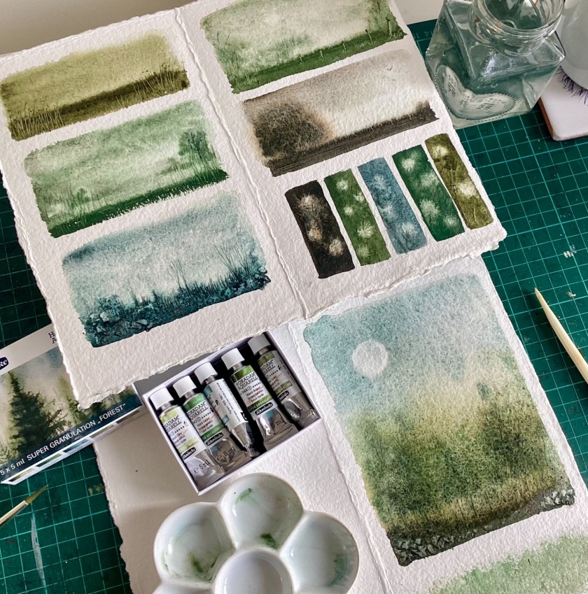
I was given these beautiful super-granulation Schmincke watercolours for Christmas but have been really busy since January and I’ve been trying to set aside some time to try them. It turns out today was the day.

Schmincke super granulation watercolour set ‘Forest’

I’m no great watercolourist but what I like most about watercolour paints is that it’s quite hard to make anything look ugly. I really like the granulation effect.

Watercolour sketches, about 2” x 4”
Single colour sketch, wet on wet, lines made with a stick
In progress

Hope your Friday is as happy as mine.

Heart of Soil sketchbook

Settle down with a cup of tea or something because there are lots of pictures today.

You might recall I enrolled on the Heart of Soil online workshop last month – you can see my earlier post about it here. I collected all the lessons into a little sketchbook, and it’s been a lot of fun to revisit some techniques I haven’t used for a while. I particularly liked the limited colour palette – just blues and yellows – and the pages in the resulting book are nicely coordinated.

Front cover with strip of hand dyed silk wrapped around
Front and back covers
String of Hearts class taught by Tiffany Sharpe
Bluebird of Peace class taught by Megan Quinlan (mine is a blue tit, since I think that’s the closest thing we have to a bluebird in the UK)
Buds class taught by Michelle Schratz

I went a bit off-piste with some of these and added some lines from a vintage poetry anthology to some of the pages, and I added a teabag pocket to this one too. I made a stencil from Tyvek for the background leaf and flower images.

The lines of poetry on the page below are from a Rupert Brooke poem, mixed up to create a found poem.

Pebbles and Peace classes taught by Leaca Young
Paper doll class (I adapted this one a fair bit just to get it on the page) taught by Kim Smith (@slaphappystudios on Instagram) and painted watercolour tubes class taught by Kelly Hoernig (@kellyhoernig.artist on Instagram)
Watercolour wildflower garden class taught by Tracey Wozniak
Watercolour/mixed media backgrounds and mark making class taught by DeeDee Catron
The one-page journal technique, shared by Kiala Givehand (@kialagives on Instagram) and a sunflower for Ukraine taught by Lorraine Bell (@lorraine_bell on Instagram)

Of course the sketchbook itself is based on the one-page sketchbook technique (you fold a single sheet of paper, cut it strategically and fold it into an eight-page booklet) but I thought it would be fun to make a tiny sketchbook to tuck inside the bigger one. The smaller version is made from a sheet of A4 paper; just me enjoying myself, really.

Collaged pages in mini-sketchbook with various marks and papers
Pages from mini-sketchbook, collaged and painted, with lines from a vintage poetry anthology

I thought it might be fun to include a little video run-through but then I noticed the colour of my hands and thought I ought to explain. I did some dyeing this morning and – I do it every time – forgot to put the gloves back on when rinsing. My hands are not normally purple, just in case anyone is worried.

A very happy collection of classes and I enjoyed them immensely. Next up, I’m doing the Traveller Blanket course with the lovely Dijanne Cevaal and am looking forward to that. Next year I hope to be teaching online classes myself, and I’ve figured that the best way to see what works is to sign up for a few myself. And of course there is always something new to learn.

Blue buds

Still having lots of creative fun with paint and paper in the Heart of Soil class – it’s a lovely course and for an excellent cause – there is still time to sign up, which you can do here.

Accidental discovery of the day is that you can very easily make your own stencils from Tyvek. Apparently Tyvek is used for making envelopes in the US but you’re more likely to find it in a DIY shop in the UK – I think it’s used in building/construction and in PPE, but it’s also been used in mixed media art for several years now for its propensity to shrink and bubble when heated. It’s about as thick as copy paper but is much more durable, and very easy to cut with a craft knife.

Simple stencil made from Tyvek, coloured with watercolour paints
Heart shape cut from Tyvek used as a stencil with dry-brushed watercolour paint

This page is based on a technique taught by Michelle Schratz (if you’re an Instagram person you can find her here.)

A6 sketchbook page based on Michelle’s Heart of Soil class

I found a couple of lines of poetry (Rupert Brooke, from a vintage anthology) and used an old teabag as the pocket for the cut-out flowers.

Teabag pocket with flowers cut from sketchily-painted vintage papers

The yellow ribbon, saved from something many years ago, is exactly the right colour, which is proof that you should Keep All Your Collage Supplies For Ever. One of these days I will need a bigger house.

Yellow and blue flowers

I am really enjoying the limited palette and am already thinking way ahead with ideas to try this in various other colours and media. Also it’s immensely enjoyable to make something just for the fun of it, without any pressure for it to turn out ‘right’, whatever that is. Wishing everyone a happy week.

He(art) of Soil

I have given myself too many things to do: no surprises there. I have signed up for three online courses, all running at the same time, while continuing to work three days a week at the desk job. I did know what I was doing, and all of it seemed like a really good idea at the time, and I’m already slightly behind. But then I get lifetime access to all three courses, and you can do them all at your own pace, so there is no rush really.

One of the classes I signed up for is a delightful mixed media watercolour course called He(art) of Soil, organised by Leaca Young (you can find her on Instagram here). It’s very accessible, with ten mixed media artists each contributing a simple project, and there’s still time to sign up if you’re interested – go to Leaca’s website in the link above for more information. All the proceeds go to World Central Kitchen, in aid of the conflict in Ukraine. The projects in this course are based on a very limited palette: just three shades of blue, and three shades of yellow, for the Ukrainian flag. The paints are made from soil and pigment and look really beautiful. You can see more about how they’re made here. I didn’t purchase the paints – it would have been very expensive to have them shipped from the USA to the UK, and I don’t need more watercolour paints, so I’m adapting what I’ve already got. You can see my substitute palette below.

A6 folded sketchbook for The Art of Soil online class

I don’t need much of an excuse to splash some paint around, so I had a very happy hour or so this afternoon painting some collage papers in these colours.

delicious pile of vintage and modern papers painted with acrylics and watercolours

I’m collecting and completing all the lessons in a little folded A6 sketchbook made with three sheets of A3 paper, folded and cut to make a little zine-type booklet. If you’re not familiar with the technique, you can find instructions for making a one-page booklet here. One of the tutorials in this class includes instructions for making this kind of booklet, which will be perfect for keeping everything together.

The projects are very simple and suitable for all abilities, and I guess you could make them as quick or as complicated as you like.

Page based on Tiffany’s Hearts project – find her on Instagram here

It’s really interesting to work with such a limited palette, and surprising to see just how many shades of blue, green, and yellow you can actually make. A lot of the artists remark on the texture of the watercolours that they’re using, describing them as quite gritty. My paints are all very smooth, so I might try using some watercolour texture medium for some of the classes, just to see how it turns out.

Loosely worked page based on Megan’s Bird of Peace tutorial. You can see her work here

Regardless of how long you might have been making art, in whatever medium, I love the fact that there is always something more to learn, something more to practice, and plenty more ways to grow. I really like the fact that this online class supports a great cause, and that the artists have given their time and skills so freely. I’m looking forward to completing more of the classes in this course.

A red bubble

Apart from splashing a bit of paint around last week while on annual leave, I’ve also made a start on setting up a shop on RedBubble. It’s a print-on-demand site where you upload your work, then people can purchase it in various forms (stickers, T shirts, phone cases, etc), and you get 10-20% of the sale price.

New shop on Red Bubble

It’s still very much a work in progress, and I will be adding to it/tweaking it over the next few weeks and months. Just dipping a toe in the water to see how it goes. It may work and it may not, but you never know unless you try these things.

I’m also teaching myself to use Procreate, a digital drawing app. It is fun and frustrating, as well as surprisingly absorbing. I have probably had too much screen time and not enough stitching time recently, but it will balance itself out eventually. New things always take longer than you expect.

My shop banner is very simple but I quite like it.

Simple banner made in Procreate using a photo of a silk embroidered moon

Most of all this past week I have enjoyed the freedom of not having to go out to work, and the luxury of time to do some of the things I’ve been wanting to do for a while. Time is one of the most precious things we have and last week it was all mine.

Quick watercolour sketch