Threads

While I’m waiting for more thread to arrive in the post, I’m compiling for myself a thread catalogue. This is really just somewhere for me to organise and categorise the various types of thread that I will be stocking and dyeing.

Handmade notebook, about 5” x 7”
Notebook, back cover – acrylic ink, Posca paint pens, various mark-making tools and textures

Initially this was just going to be a notebook and cover, but, well, these things often get a bit out of hand, and now it’s slightly more complicated than that.

Book wrap – couched threads and yarns on hand-dyed silk noil

The colour palette came about by accident, after I dyed these thick cotton boucle yarns, which will wrap around the whole thing to tie it shut:

Chunky cotton boucle yarns

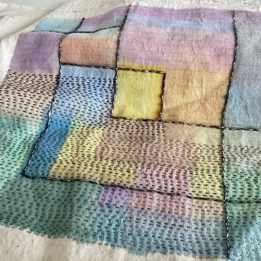
I really like the way this very thick-and-thin dimensional cotton slub yarn can be flattened when it’s couched with long stitches:

Anyway, back to over-complicating things, and now it’s a notebook in a wraparound cover, with a pocket for index cards carrying samples and information about the various threads. The pocket came from a silk shirt that I dyed.

Wraparound book cover with notebook and pocket for index cards

I find it very useful to round up information for comparative purposes, so that I can see at a glance how (for instance) silk and cotton threads compare in terms of weight or thickness. Thread weights are sometimes given as an nm figure, which I don’t find particularly helpful. Broadly, this system translates as the number of meters per 1g of thread (the first number) and the number of plies or strands in the thread (the second number). So the silk thread pictured below has a nm of 8/2, which tells you it’s a 2-ply thread, and you get about 8 metres of it per gram. For comparison, standard sewing thread (the kind you would use in a machine) is usually something like 60 or 70/2, which is a lot finer. As a visual thinker, I find it much easier to picture thread weights in terms of wraps per inch – I’m not certain but I think this is a system that is more commonly seen in the knitting world, to help with substituting yarn weights in patterns. I find it much easier to understand that the silk thread below has about 23 wraps per inch (the number of times you can wrap it around a one-inch strip without leaving any gaps).

Silk thread wrapped around card, 23 wraps per inch

Finer silk threads, which have an nm of 16/2 and 30/2, have wraps per inch of about 29 and 44 respectively. I find this easier to visualise.

Thread index cards

I’m using commercial cotton perle threads as controls, just to see how the weights of my various hand-dyed threads will compare. And even that isn’t as ‘standard’ as you might expect. I’ve used DMC perle 3 to 8 to count wraps per inch, but I didn’t have enough DMC perle 12 so had to use a Valdani perle 12 instead. And here’s the surprise – there isn’t a huge amount of difference between DMC perle 8 (43 wpi) and Valdani perle 12 (44 wpi). I can see by enlarging the photos that the 12 card maybe isn’t wrapped as closely as the 8, but that would only account for another 3 or 4-ish.

Commercial cotton perle threads

This is turning into quite a rabbit hole, isn’t it? I expect somebody somewhere will tell me I’ve got too much time on my hands, but I find this kind of thing really fascinating. Ultimately I suspect this will end up being a self-referencing closed system that only I will understand, and I think that’s probably ok. As soon as thread reinforcements arrive, I’ll be able to start winding skeins for dyeing again – but in the meantime I’m enjoying some quite reasonable down time.

Matchmaking

I hope no one’s bored with book covers yet. I’m making a cover for a 12” square sketchbook – though I expect it will be more of a notebook, really, with drawings. Somewhere I can jot down ideas and designs for Red Bubble.

Book cover in progress

I’ve always enjoyed seeing red and turquoise together. It started me thinking about the concept of clashing colours, and I’m not sure that I agree there is such a thing. In my experience, you can generally put any two or three colours together and they will sit side by side fairly happily. Red seems to go with pretty much anything; so does purple. I think there is the potential for a problem when you put too many different colours together, but even then you can generally tone them down by adding some black and white.

Front cover, about 12” square

The main problem I’m having is trying to get an accurate photograph. If the red is right, the turquoise is wrong, and vice versa. Suffice to say the colours are richer and deeper in real life.

Moon flowers

The design initially started with the red circle, which is a piece of shot silk from an old sari layered over a circle of felt. I was going for a fairly obvious red bubble, but then the little flowers popped up and it’s turned into a kind of moon flower arrangement. These things happen. I find the thing that grows organically in its own way is usually better than the thing I was aiming for. You just have to trust the process sometimes. The turquoise background is pieced together using strips from the edge of a hand-dyed vintage tablecloth. You can see the creases, which formed the edge of the cloth where the fabric had been doubled. They won’t iron out, and in any case I quite like these scars from a previous life.

And then I found a piece of really ugly fabric. I don’t often have dye disasters, but this poor thing was definitely one of them. Usually you can rescue a disaster by over-dyeing it, but I think this one has been over-dyed a few times and never looks any better.

A dye disaster

But actually it looks ok here. It looks as if it has found its place in the world. Maybe ugliness is as much in the eye of the beholder as beauty. Maybe there is even no such thing as ugly. Beauty is, after all, one of many problematic cultural concepts that just excludes the non-conforming. It’s not exactly a match made in heaven, but then most of us can rub along ok with most people most of the time. Perfection is virtually unattainable. I will settle for OK on this occasion.

The back almost made itself. I already had the patchwork circle, pieced a while ago when I was gathering together some scraps of red print. These are mostly shiny/glitzy silk and satin, fabrics I wouldn’t ordinarily use much. But put them together, cheek by jowl, and they seem very happy.

Patchwork circle, paper-pieced, about 9” diameter

I often think auditioning fabrics to see which of them looks good together is a bit like sending them on a blind date. Sometimes they instantly find true love, and sometimes they never want to see each other again and end up back in the drawer. Eventually there will be something for all of them, even if that turns out to be solitude. Some fabrics don’t need others; they do just fine on their own. Some need company. Sometimes which of them ends up together is more luck than judgement.

Red and gold glitz

Thinking sideways, not knowing

I’ve been revisiting my Lines on the Land sketchbook this week. It’s a collection of sketches and designs based on ancient landscape features like standing stones and rock art, just to explore some of the patterns.

Lines on the Land, front cover

I made this sketchbook myself, using signatures of cartridge paper, and then collaged and painted the pages before assembly. I prefer to make my own sketchbooks because I have more control over the size, shape, and proportions. I don’t always like the proportions of standard A4.

I usually cut off part of the page when making a sketchbook if I know I’m going to include fabric or stitched samples, as with this one below which is waiting for me to do something with it:

Deliciously blank sketchbook waiting for an adventure

When I get round to doing something in it, I will be able to attach a stitched sample to the short tab which will form a new page that will be separate from the paper pages.

I didn’t do that with the current sketchbook; there are some pull-out pages, but no partial pages. While trying to figure out a way of sticking stitched samples in it without covering a finished page, I accidentally discovered that you can add pages sideways:

Extra page glued over the top edge of existing pages

You can lift up the stitched sample to reveal the completed page underneath. I like it. Necessity, invention, etc.

Mixed media sketch of Callanish beneath the stitched sample

Of course I made a cover for it. I do like a well-dressed sketchbook.

Front cover, patchwork earthwork
Back cover, patched ragged spiral

I’ve found spaces for some stitched samples I made a while ago:

Mixed media sketchbook page, mini monolith
Mixed media sketchbook page, circles
Textile sample, layered scraps and sheers on painted handmade paper

I don’t always think of a sketchbook as preparatory work for something bigger or better, though it often is that. This may or may not lead to some larger textile work. Part of the adventure is the not knowing, the voyage in the dark, and true of any creative venture I think. Having a go, never knowing whether what you’re making is any good or not. And then realising that it doesn’t really matter, if you’ve enjoyed doing it.

Little collages with drawings added

Pocket, handkerchief

Best Tommy Cooper voice:

Pocket handkerchief

Hand-dyed vintage cotton handkerchief

Handkerchief pocket

The same handkerchief. Magic!

Just like that.

Ha!

Inside front cover with useful pocket

Klee sketchbook cover

I finished my painted/stitched version of Klee’s painting ‘Clarification’, which is part of the cover for a sketchbook. I’m fascinated by that solid line across the lower third, which also features in the original painting, and somehow ties the whole thing together.

Paint and stitch based on a section of Klee’s ‘Clarification’ (1932)

I decided though that this is going to be the back cover, not the front, so there has been a bit of cutting and splicing.

Moving the front to the back

I’ve kept the seam on the right side because I’m going to cover the spine area later so the raw edges will be covered. The sketchbook is a 12” square spiral bound one, so I didn’t want the raw edges on the back interfering with the wire spiral, and I didn’t want the bulk of a turned seam.

So now I’ve started on the front cover, which is based on Klee’s ‘Small Picture of Fir Trees‘ (1922). I did a sketchy collage just to understand the colours and shapes and used a view finder to isolate a square area.

Klee’s ‘Small Picture of Fir Trees’ 1922

I’m trying this one in layered sheers and semi-sheers, with a base of hand-dyed cotton organdie and bits of silk organza over the top. You can just see the outline drawing underneath.

Sketchbook cover in progress

I really like layering sheer fabrics. I used to use them a lot; less so these days but it’s maybe something I might revisit. I like the way they are solid and transparent at the same time.

Pile of hand-dyed sheer fabrics – organdie, organza and chiffon, with some net and vintage sheer scarves
Building up the layers

The best bit is putting in some tacking stitches to get rid of the pins, which will be my next step. Then you can see much more clearly what you’re dealing with. Less hazardous too. I don’t know why, but I am always surprised by how sharp pins are. Makes me feel like I’m maybe not the sharpest pin in the box.

Immersion

One of the perks that comes with working at a university is free access to an academic library, and last week I found this:

Paul Klee Notebooks Vol. 1

You can read it free online, actually, but I prefer books to be on paper. I like leafing through pages and don’t like scrolling up and down a screen. It was good exercise carrying it home too, so twice the benefit.

I’ve had a completely free weekend so have been immersing myself in Klee and his life and works.

Notes

Having started to read his words, I feel I am beginning to understand him and his work better. Weirdly, I understand myself better too. I periodically berate myself for not drawing more often (what kind of artist doesn’t draw?) but then I read Klee and feel more validated about valuing process over object and trying to explore the intangible. I admire people who can draw with photographic realism but learning how to do that doesn’t really interest me. I don’t want to draw what I can already see. Klee famously said, ‘art does not reproduce the visible but makes visible’. And I guess I draw with a needle and thread instead of a pencil.

Klee’s writing is, as you would expect, pretty dense, so in between nibbles of philosophical art theory I’m working on a sketchbook cover. I accidentally deleted the photo I took of it in progress, so this is just a screenshot:

Watercolour on loom state cotton, inspired by Klee’s painting ‘Clarification’ (1932)

It’s just regular watercolour on fabric. It won’t ever be washed so it doesn’t matter about fixing the colour. The fabric I’m using is loom state cotton, and it’s a really good surface for sewing on. It’s not quite as thick as furnishing fabric, but a bit more substantial than heavyweight calico, and a nicer weave than cotton canvas – it’s quite a fine twill weave, similar to impossibly lightweight denim, if there could be such a thing. I’ve started to add rows of running stitch in threads similar to one strand of DMC floss.

The colour seems to be fading slightly already, but that’s ok. I thought it was a bit too bright to begin with anyway. You can see how I’ve had to draw lines on it to keep me on the straight and narrow and not go wandering off on a tangent. I’m not keen on the way the yellow square has ended up being more or less right in the middle, but it’s never going to end up on show anywhere so I can overlook that I think.

Front cover of sketchbook in progress

To dye for

I had a few days off from the day job this week so at last had time to dye some fabric and thread. This has been on the to-do list for months.

Smorgasbord

Some for me, and some for you, eventually. There will be a shop update when I can get round to sorting these into groups.

Delicious!

While I was waiting for everything to dry, I made a cover for the little notebook I use for dye notes. I made the book many years ago, when I first started having a go at dyeing. I don’t record everything in it, as most of my dyeing is quite intuitive so colours are often not repeatable. There are other dyers out there producing set lines but I prefer the more individual approach.

Colour notes from 2007, handmade notebook A6 size
A6 notebook cover, fabric from Hipposinhats
Hand-dyed silk and cotton threads in action

I really like the colour test card. Accidental abstract art in action, I’m calling it.

Dye splodge colour test

Back to sorting and labelling threads…

Skeins of silk and cotton thread

Stitch journal cover

I finished the cover/bag for the stitch journal – something to carry it round in, and something to keep the sun off it now we’re heading for longer days.

stitch journal cover, about 15″ long

It’s basically a quilted/lined tube with a circular base and a casing around the top for some hand-dyed ribbon to tie it closed. Initially I was a bit disappointed because it turned out bigger and bulkier than I intended, and the stitch journal rolls up quite small. And then I saw this:

very large industrial wooden bobbin

I bought the large wooden bobbin some time ago with no real purpose in mind. But – what do you know – it fits the stitch journal cover *perfectly*. And furthermore, the stitch journal itself fits the bobbin *perfectly* if I hem the edges:

stitch journal with bobbin, on a roll

So the over-sized cover is actually exactly the right size, I have a purpose for a spare bobbin, and a permanent home for the stitch journal when it’s finished. I don’t know about you but I call that a roaring success. An accident for the most part, for which I can’t take much credit, but a success nevertheless.

a little gentle seeding and running stitch on beautiful eco-printed silk by Jane Hunter Textiles

So I’m taking this as a little life lesson: most things really do turn out OK in the end.

In the middle

I don’t feel very productive at the moment. It’s not really a question of being stuck, since I think I know where I’m going next in terms of creating a new series of art work. Nor is it a matter of not knowing where to start, because I think I know that too. It isn’t lack of energy or motivation either as I have plenty of both. It isn’t even the unrest and terrible conflict out there in the world, I don’t think. I wonder if it is to do with the season. We have just passed the spring equinox, where day and night are perfectly balanced, and I wonder if the temporary desire to stand still, to look and think for a while, is an expression of that pivotal moment of poise, standing between two halves. I see a lot of people calling this the first day of spring, but in fact the equinox is the mid-point of spring, since it falls exactly halfway between the midsummer and midwinter solstices.

Despite the hesitation in starting something big, I do like to keep busy and I usually find myself in the middle of something. At the moment it’s a useful thing as well as a decorative thing – and it’s interesting that I feel the need to make the distinction between useful and decorative. It’s that old establishment-driven art/craft chestnut, isn’t it, where art is purely decorative and craft is useful. I like to think textiles work confounds that over-simplified distinction.

Anyway, here I am, finally getting to the point after a bit of waffle and introspection. I’ve started making a cover for the stitch journal, which will be a cylindrical bag. I’ve made a start by layering strips of ribbon and tape onto a piece of hand-dyed cotton sheet.

cover for the stitch journal in progress

The strips of silk are from a hank of white sari ribbon that I dyed and ironed flat. I’ve turned the edges under by about 1/8″ and attached them with very simple straight stitches. I will probably go back and add more hand-stitching. It’s an intuitive process, and I will know when it’s had enough.

strips of hand-dyed silk sari ribbon, ironed flat
hand-dyed silk ribbon ready for couching

When all the vertical lines have been attached, I will add this horizontal band of silk expertly and beautifully eco-printed by Jane Hunter:

strip of eco-printed silk by Jane Hunter Textiles – see link in text above

This will keep me busy, while I think about where I’m going next. I find the mind ticks over nicely while the hands are engaged in some quiet stitching.

Sampler book cover

In the interests of keeping busy, I made a start on the cover for my sampler book.

birdie in his natural habitat

I’ve spent a lot of time thinking about how to tackle the cover. I considered various kinds of needlepoint, cross stitch (really didn’t want to do any more of that) and a variety of seams. In the end I went for my usual style of book cover, which is layers of strips laid on a foundation fabric. I used modern, vintage and antique silk and cotton fabrics, mostly hand-dyed.

cover in progress

I really like old lace and ribbon, but I don’t tend to use it much. I thought this was probably a good place for it.

layered fabrics, lace and ribbon with hand stitch

A couple of weeks ago I acquired a few old wooden bobbin reels – more on that later, there are plans afoot – all of which came with very old dusty thread still in place. Most of the thread was unusable, very brittle from age and light damage. But on two of the bobbins, once the outer layer of damaged thread was removed, the rest of it appears to be sound. I’ve dyed some, and have road-tested the finer of the threads on this cover. It breaks quite easily so wouldn’t be any good for sewing seams, but it seems fine for surface decoration.

vintage cotton thread from an old mill bobbin, hand-dyed

As with the sampler book itself, I found myself wondering whether Ellen Mahon would like the cover I’ve made. I wanted to make it pretty for her.

Hand-dyed vintage viscose ribbon, very soft and silky

I wondered about whether I should label the cover with words, whether I should stitch the words ‘sampler book’ somewhere on it. I decided not, in the end. For one thing I’m not very good at stitching lettering, and for another thing I didn’t think it needed words. I really like the way stitching conveys its own meaning without the need for words as well. I always think hand-stitching is more like writing than drawing. I often find myself recognising artists’ work by their stitching the same way I might recognise the handwriting on an envelope.

Sampler book with cover
Back cover

I hope Ellen would approve.