Genuinely don’t know where August went. I say this every month, I know. Every day seems to pass in a blur.
I had some reservations about this template, but it’s turned out to be my favourite so far this year.
August
There were lots of options for how to stitch the radiating segments but generally my preference is for keeping things simple. Running stitch is restful to work, and can look really effective.
August, detail
I was thinking about first harvest for this month – that’s grain – and running stitches/small isolated stitches look like seeds, from which all things grow. And seeds are the culmination of a plant’s annual work too, so an end and a new beginning all at once.
August, detailAugust, detail
The back, as always, is a kind of map. Or a mirror, perhaps. Beginnings and loose ends, which is what life is made of.
August, back
Next month – well, we’ll see how it turns out. The template was designed to indicate second harvest – that’s fruit – berries, apples, etc – but somehow I’ve made it look like hagstones.
September, waiting
I like hagstones. To me they are magical. Let’s see how they turn out. There’s no real plan, and no right or wrong. Just days, waiting to be filled.
…after the second bank holiday weekend in a row. It’s probably done me some good to take a couple of days out, though time off isn’t quite the same when you get to do what you love for a living.
The more industrious corner of my work table doesn’t know about time so it’s still exactly as it was when I downed tools on Friday. I see now it needs dusting. Thread and fabric shed their fibres all the time.
You can also see a couple of beautifully smooth pebbles from a recent trip to the seaside. I was lucky enough to find a hag stone, a pebble with holes in it, which you can just see hanging above. It’s sometimes said that they find you. I love to marvel at how old these things are, how many millions of years they’ve been around. How much time they hold.
work, waiting for me to catch up
Also on the table, appropriately enough, is Marking Time II (and thank you, Dawn, for naming it). This is another long cloth pieced from hand-dyed vintage fabrics and stitched with motifs from ancient rocks and prehistoric marks on the land.
ancient hill forts, couched cotton yarn with simple stitch on hand-dyed linen
The beautiful lightweight cotton fabric in the section below is eco-printed by Jane Hunter and makes the perfect ground for some couched cup and ring marks. I will add more stitch, of course.
cup and ring marks in progress
Easing myself back into the working week, and hoping your week ahead is a good one.
I gave myself a break over Easter. I’ve come back to the cloth that (as yet) has no name: the first in a small series about cup and ring marks, ancient circles and spirals, lines and basic marks.
Nameless cloth in progress
These lines and circles seem to communicate without words. Maybe they come from a time before language; certainly before literacy. There is a kind of magic about them, a deep and unfathomable wisdom in their shapes.
Couched spirals with running stitch and straight stitch
I’m enjoying the earthy colour palette here, and the repeating motifs.
Marks and lines
I’ve been invited to give a talk to a local stitching group and I’m just gathering together some inspiration. I’ll take this unfinished cloth too, mostly to see if anyone can help name it.
Sketchbooks, daily stitching, and mixed media all up for discussion
I’m continuing with the linen cover for this year’s stitch journal.
Running stitch on linen
I hardly ever do straight lines intentionally. I used masking tape to keep me on the straight and narrow. Initially I started with lines of running stitch to give some sort of structure on which to build something more complex. I was thinking maybe couching, or columns of embroidery, or whipped running stitch. If ever I don’t know what to do with a blank canvas, I generally find that making a start with running stitch takes it where it needs to go. And sometimes it turns out that running stitch is all it needs. I find I’m really liking the simplicity of it.
Running stitch – straight lines! Me?
Initially it was going to be just blue, but I’ve started adding some greens and some space-dyed threads that give a flash of colour here and there. I’m using fine-ish threads – nothing thicker than perle 12 – and mostly my own hand-dyed cotton and silk. I like the unpredictable subtle colour changes that you get with hand-dyed thread.
Running stitch lines
The title box is outlined with couched silk boucle. I’m not sure what the title will be yet. The heavyweight linen came from a vintage French shirt, and is difficult to stitch on – I have had to resort to a thimble, which I hardly ever use – but beautiful quality. I can’t imagine it having been a very comfortable shirt, but I think it will be a perfect journal cover.
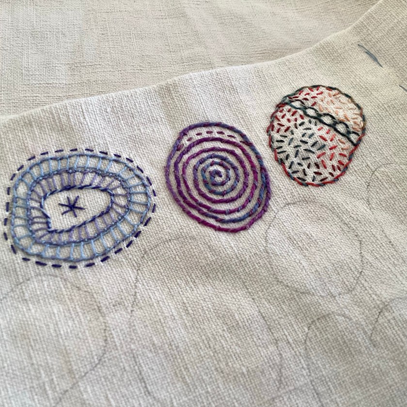
This cloth is the first in a series exploring the timeless marks found on ancient rocks. Circles, rings, spirals, and lines – all quite abstract but eternally symbolic and full of meaning.
Cup and ring marks in progress
I’ve used hand-dyed silk bourette yarn for couching the rings. It has a lovely soft texture and, unusually for silk, doesn’t have so much of a sheen. It looks and feels more like very soft wool.
The rings on the grey silk band are made with very fine silk tulle, which weighs almost nothing but has a strong will of its own and can be quite tricksy. You have to work very slowly with it and pin it down as you go, otherwise it tends to wriggle away and wander off. This is not a great photo but was only intended to show myself where the rings needed adjusting a little before committing to stitching them down.
Silk tulle rings
A few stitches later, they’re sitting quite nicely.
Silk tulle rings on hand-dyed silk, in progress.
It’s taking its time, and I’m sitting with each mark to see where it needs more. These plain running stitch circles may or may not be finished. The cloth in this section is textured silk, similar to silk noil but slightly heavier and thicker.
Running stitch circles on textured silk
Taking time to make time. All the time is already there. It’s just a matter of finding it.
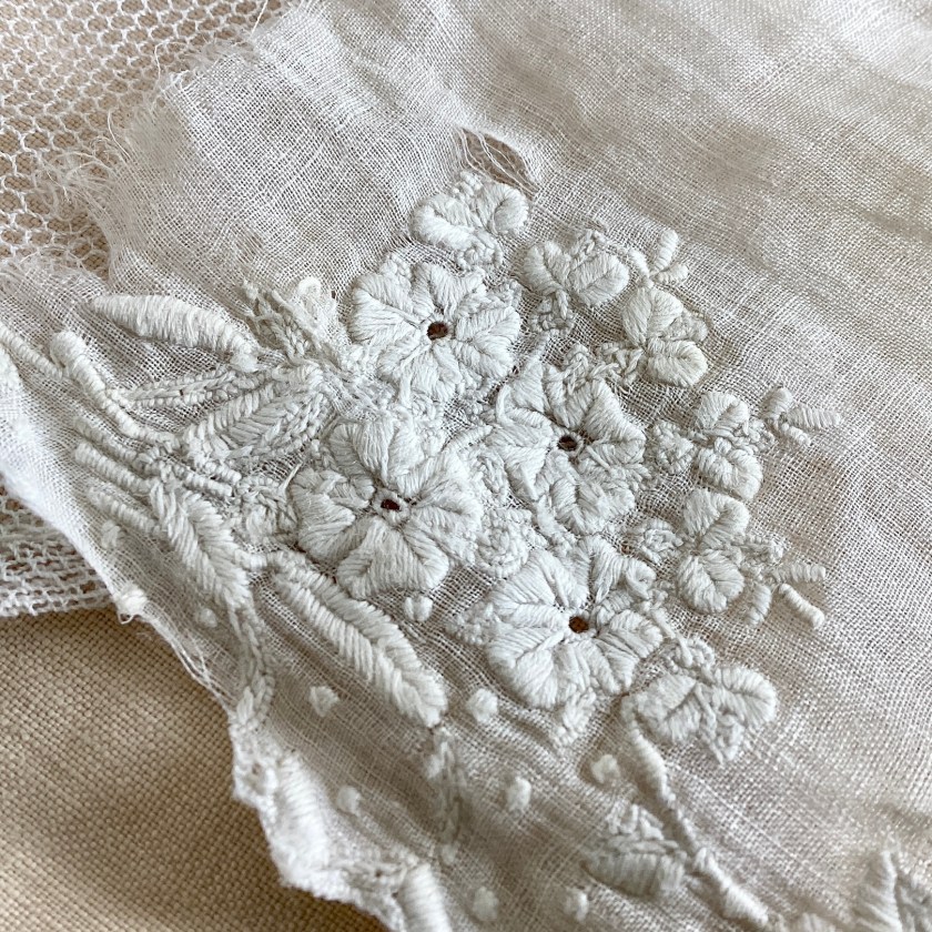
We all have some – the precious, fragile treasures that are taken out from time to time, admired, and then carefully laid back in their box. Relics from another age, fragments of a life long ago laid aside. Somehow they stay with us, surviving war, flood, and other catastrophes.
Vintage/antique lace and trim
They’re far too lovely to live in a box, but that’s probably the best place for them, long term. I’ve chosen a few very fragile, ragged fragments and I’m in the process of stitching them to a long, layered cloth made from pieces of vintage linen and cotton.
Long cloth in progress
I’ve had these beautiful lace fabrics for many years, and somehow it just seems time for them to be out in the world again. The vintage embroidered monogram below had been glued to a paper label by its manufacturer, and is gradually coming away. The paper is very fragile, but I want to stitch the whole piece to this cloth so I’ve stabilised the paper by brushing acrylic medium on the back and then sticking it to some antique cotton bobbinet. I don’t know if this will hold, but it feels a lot more robust than it did.
Vintage French embroidered monogram
The very fine cotton cutwork trim on the section below has been hand-embroidered, and was once part of a petticoat. The monogrammed silk fragment is from a chemise, also hand-stitched.
Antique cutwork and fragment from silk chemise
The tiny pintucks in this silk are from a christening dress. Looking at the quality of the machine stitches, I think it’s probably been sewn on a manual treadle machine.
Silk with pintucks
And the nineteenth-century fragment below, impossibly fine, is from a tippet, a cross between a shawl and a scarf, worn around the neck or shoulders. The fabric is thinner than tissue paper.
Fragment of embroidered tippet, about 1.5” square
The embroidery stitches are tiny, and I think it’s been done by hand. If you look at the back, it lacks the rigid regularity that machine work has.
Embroidered fragment, back
Inevitably, as I’m stitching, I’m thinking about the women who made and wore these fabrics. It seems strange to think of them as dead, when what they left behind is so alive and has such presence. There is a kind of sadness, a touch of the Miss Havisham, perhaps, about this piece; but there’s also an immense strength and a palpable sense of survival. How something can be so insubstantial, so easily torn, so translucent, and yet still so strong and beautiful, amazes me every time.
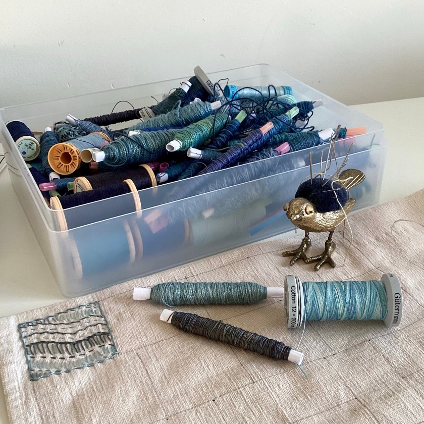
While I’m waiting for more thread to arrive in the post, I’m compiling for myself a thread catalogue. This is really just somewhere for me to organise and categorise the various types of thread that I will be stocking and dyeing.
Handmade notebook, about 5” x 7”Notebook, back cover – acrylic ink, Posca paint pens, various mark-making tools and textures
Initially this was just going to be a notebook and cover, but, well, these things often get a bit out of hand, and now it’s slightly more complicated than that.
Book wrap – couched threads and yarns on hand-dyed silk noil
The colour palette came about by accident, after I dyed these thick cotton boucle yarns, which will wrap around the whole thing to tie it shut:
Chunky cotton boucle yarns
I really like the way this very thick-and-thin dimensional cotton slub yarn can be flattened when it’s couched with long stitches:
Anyway, back to over-complicating things, and now it’s a notebook in a wraparound cover, with a pocket for index cards carrying samples and information about the various threads. The pocket came from a silk shirt that I dyed.
Wraparound book cover with notebook and pocket for index cards
I find it very useful to round up information for comparative purposes, so that I can see at a glance how (for instance) silk and cotton threads compare in terms of weight or thickness. Thread weights are sometimes given as an nm figure, which I don’t find particularly helpful. Broadly, this system translates as the number of meters per 1g of thread (the first number) and the number of plies or strands in the thread (the second number). So the silk thread pictured below has a nm of 8/2, which tells you it’s a 2-ply thread, and you get about 8 metres of it per gram. For comparison, standard sewing thread (the kind you would use in a machine) is usually something like 60 or 70/2, which is a lot finer. As a visual thinker, I find it much easier to picture thread weights in terms of wraps per inch – I’m not certain but I think this is a system that is more commonly seen in the knitting world, to help with substituting yarn weights in patterns. I find it much easier to understand that the silk thread below has about 23 wraps per inch (the number of times you can wrap it around a one-inch strip without leaving any gaps).
Silk thread wrapped around card, 23 wraps per inch
Finer silk threads, which have an nm of 16/2 and 30/2, have wraps per inch of about 29 and 44 respectively. I find this easier to visualise.
Thread index cards
I’m using commercial cotton perle threads as controls, just to see how the weights of my various hand-dyed threads will compare. And even that isn’t as ‘standard’ as you might expect. I’ve used DMC perle 3 to 8 to count wraps per inch, but I didn’t have enough DMC perle 12 so had to use a Valdani perle 12 instead. And here’s the surprise – there isn’t a huge amount of difference between DMC perle 8 (43 wpi) and Valdani perle 12 (44 wpi). I can see by enlarging the photos that the 12 card maybe isn’t wrapped as closely as the 8, but that would only account for another 3 or 4-ish.
Commercial cotton perle threads
This is turning into quite a rabbit hole, isn’t it? I expect somebody somewhere will tell me I’ve got too much time on my hands, but I find this kind of thing really fascinating. Ultimately I suspect this will end up being a self-referencing closed system that only I will understand, and I think that’s probably ok. As soon as thread reinforcements arrive, I’ll be able to start winding skeins for dyeing again – but in the meantime I’m enjoying some quite reasonable down time.
I’m aiming to use a different template for each month this year, just to see how that works. February is pebble-shaped ‘spots of time’, a phrase from Wordsworth’s long poem The Prelude.
1st and 2nd February 2023
From Wordsworth’s text:
‘There are in our existence spots of time,
 That with distinct pre-eminence retain
 A renovating virtue, whence…
                           …our minds
 Are nourished and invisibly repaired’

William Wordsworth, The Prelude (1850), Book 12, ll.208-15
3rd/4th/5th February 2023
Spots of time in this context are visual representations of time and memory, a spotlight on a few moments of life, that can hold peace and bring renovation. Time, experience and memory are really all we have. That’s our life. With the passing of time, experience becomes memory.
4th and 5th
A few stitches on a cloth is a few footsteps on a path. We may not know how long the path is or where it goes, but along the way there will be these little dots of peace and joy.
I really like the fact that this is one single layer, and that the back is accessible. I’m not so sure how that will work when the whole thing is folded concertina-style into a book, when the back will then be hidden under the folds.
The other side
The cloth is starting to soften very nicely. It’s just like getting to know a new friend.
Another year begins, and along with it another round of daily stitching. Let’s see where this year takes us.
The last 5 days in stitch
I know a lot of people find January very difficult (here in the northern hemisphere, that is) because it’s long and cold and still dark, but I like it. January is generally quiet, after the hectic days of Christmas and New Year, and not much happens – and that suits me just fine. I’ve kept the colour palette here fairly wintery and subdued but will begin to introduce some spring colours next month.
January 1st to 7th
It’s really interesting to look at what you’ve stitched, and to reflect on what meaning you find there. When your mind is still but your hands are busy, a kind of magical insight emerges and you end up producing a pattern in which you can access your intuitive knowledge. We all know things without realising it, and sometimes it can be difficult to silence the chattering mind enough to see that knowledge. So far I see home, which is where I work now and my safe place, a light radiating peace and joy, a mountain to climb (good job I like climbing mountains) and I see paths leading to unknown places. As I continue to work on putting together an online course, I can see that my stitching absolutely reflects where I am.
Some days I prefer the back, which shows you how you got there:
The other side
I’ve been utterly delighted to see emerging stitch journals and hand embroidery from talented stitchers sharing their work in my private Facebook group. It’s becoming a lovely, thoughtful community of hand stitchers, of all abilities, connecting with and supporting each other, learning from each other, and generously sharing knowledge. If you’re working on your own daily stitching and you’d like to join, you will need to answer three simple questions and agree to some basic group rules. There are no right/wrong answers to the questions, but I do need to know a little bit about you before I can approve your request. This just helps everyone (including me) feel safe. If you’re in, you can be sure that you’re among friends.
Preparing a strip of vintage linen/cotton bed sheet
I’m using the same fabric as last year: vintage metis (linen/cotton blend) bed sheet, about 13” wide by about 100” long. I’ve hemmed the long edges, just by turning an inch or so under, giving a finished width of about 11”. I’ve given it a quick dip in some tea just to knock back the whiteness, which gives me the option to use white thread some days.
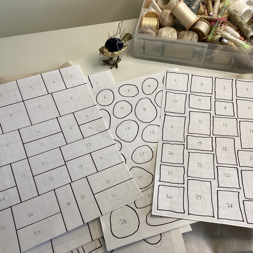
This year I’m using a slightly different format. Instead of one long continuous scroll, I’ll fold the strip concertina-style to form twelve separate pages so that the finished thing will look like a book.
In book form
I’m trying different templates this year too, just to see how it looks. Some pages will be circles, some will be rows or columns, some blocks will have spaces between. Haven’t quite thought this through, but the process is supposed to be intuitive, so I don’t want to over-plan.
Trying different layouts for each month
I’ve begun with some very simple stitches. I’ve marked out this month’s grid but haven’t yet completed the outlines – I may do that as I go along, I’ll see how it goes. There are no rules.
A blue beginningThe back, showing the hemmed edge
From today I am no longer employed, so this marks the start of a new way of life for me and an adventure. I’m looking forward to having more time this year to focus on my own work, to set up some online classes, dye more thread and fabrics, create some embroidery patterns and templates – and maybe a few more things besides.
Lines
I’ve been very happy to know that so many people are planning to start their own daily stitch practice. I find it very restorative to reserve a few minutes a day for some quiet time with fabric and thread. Just a few stitches, just to see what happens.
I also like seeing time mapped out like this. A calendar has the same function, of course, but somehow this has more impact for me.